Black and orange, it's very bold and bright combination, allowing you to create original fashionable interiors. If the black and orange color scheme is slightly excessive for decorating a bedroom or living room, then it is ideal for the kitchen.
The advantages of this combination are non-triviality and relevance, a beneficial effect on a person’s mood. Juicy orange shades look even brighter and more attractive against a black background.
Design options for a black and orange kitchen
If you chose this color scheme for the design of your kitchen, think about how exactly you will use it. It is important to initially decide whether the surfaces of the furniture and decoration will be predominantly glossy or matte, how intense the main orange shade should be, what color should be more - orange or black. As an example, below are several design options for a bright kitchen.

Orange set, black countertop
The simplest and practical option. This is the case when there will be much less black in the interior than orange. Set orange color can now be purchased at finished form. But if you want some special shade of orange, then kitchen furniture will have to order.

A black countertop can be extremely practical and comfortable, but it can also turn out to be incredibly fancy and difficult to maintain. It all depends on the type of surface. On a perfectly smooth, monochromatic surface, all the stains and specks of dust are visible.

This type of tabletop looks very impressive, but it needs to be constantly cleaned and polished. But tables with a discreet pattern imitating natural stone or wood look clean and tidy even after simply wiping with a sponge. Now you can order a black countertop with original splashes of a different color.

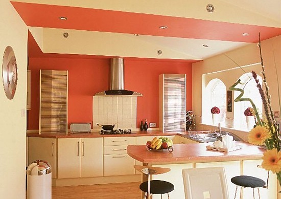
Let's say you have already selected a black countertop and an orange set. What should be the finishing of the walls, floor and ceiling in this case? To avoid excess color, it is better to make a light, dim finish. The walls can be a matte peach shade. For ceiling will do white color, and for the floor - marble black.

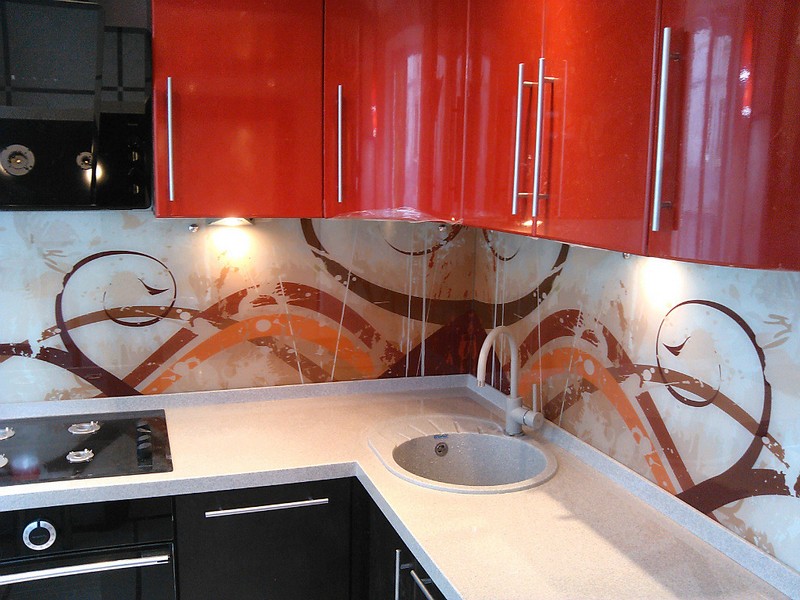
Black apron
Another simple option is to decorate the entire kitchen in various shades of orange, and highlight this composition with a black apron. An apron, if made expressive enough, will become an excellent accent in the kitchen design.
The apron is located above work surface. It often has to be washed from kitchen dirt, and besides, it is adjacent to the stove and sink. Therefore, it must be made of durable, moisture-resistant and heat-resistant material. And, again, it should be “non-marking”, that is, with a pattern or relief texture.

The apron can be made of the following materials:
- ceramic tile;
- face brick;
- mosaic;
- artificial or natural stone;
- photo wallpaper covered with glass;
- printed glass panels.
For the design, colors that harmonize with orange are suitable - gray white, all shades of orange. Most economical option, these are ceramic tiles interspersed with a different color. The most expensive will be glass panels with photo printing.

Black bottom, orange top
Nowadays, two-color sets are very popular, which give the kitchen a modern and stylish look. Dividing a room horizontally with color is actively used today by leading designers.

If desired, you can do the opposite and paint it black top part kitchens. But in this case, the interior may turn out to be too “oppressive”.

In this version, the lower floor cabinets have orange fronts, and the upper ones are painted orange. The integrity of the set is maintained due to the same fittings. The tabletop, as a border element, can be of any harmoniously fitting color. It can be black, orange, gray or white.

By finishing the walls, floor and ceiling, you can support the division of the kitchen into a black bottom and an orange top. But as a result, the interior will probably end up with too much black, so the dining room furniture ( dinner table and chairs) it is better to choose light shades.

Additional colors
An interior composition of two colors will become even more self-sufficient if it is slightly diluted with other shades. The choice of additional shades depends on what effect we are achieving, whether we want to enhance the contrast of black and orange or smooth it out, whether we need to make the kitchen more sunny, or glamorous and shocking, etc.

White
With a combination of black and bright orange interior It often turns out to be somewhat difficult to perceive. There is nothing wrong with that if you spend very little time in the kitchen. But for a long stay, the atmosphere should be quite light. Adding decorative or finishing elements white, and the kitchen interior becomes much more comfortable.

A white element can be a ceiling, a dining table, a curtain, one wall, a countertop, a set of household appliances or tableware. If the base orange is not very bright, the decor will turn out to be quite cozy without any white splashes.

Grey
In the case where the kitchen is made in a modern, trendy style, with glossy surfaces, with a minimum number of decorative elements, it is better to choose gray instead of white to dilute the black and orange palette. It should be a light metallic or mousey shade.

Add grey colour Can different ways. Black countertops with gray veins take on the appearance of expensive wooden surfaces. natural stone. The same veins will make the ceramic tile backsplash less easily soiled.

The easiest way to bring gray into your kitchen interior is to choose a set of metallic-colored household appliances.
Brown
The brown color will become a transition from black to orange. Therefore, if you are not afraid of an overabundance of dark shades, you can safely use this color in the interior. The use of brown shades as additional ones allows you to simplify the process of decorating a kitchen, since all the details of a natural wood color automatically become appropriate.
Black and orange kitchen style
This combination of colors practically does not limit us in choosing a style. However, it is not easy to apply it in traditional classics. Only if you take a completely faded orange and a minimum of black, but in this case the possibilities of bright color contrast are lost. Therefore it's better black and orange kitchen do it in high-tech or glossy modern style.

When creating a kitchen in modern or high-tech style, the main color accent should be work zone kitchen, including a set, countertop, apron, household appliances. All other elements - walls, floor, ceiling, dining area - are a background designed to emphasize the chosen stylistic direction.

A spacious kitchen can be designed in any of the ethnic European or African styles.

To do this, choose a deep orange color in which to paint wooden furniture. The walls are a tone or two lighter. The floor is wooden - dark brown or black. The apron and countertop are black. Decorating a small kitchen in this way will lead to a visual narrowing of the space in the room, and the kitchen will turn out to be very cramped and not comfortable.

Common Mistakes
What to avoid when designing a black and orange kitchen.
- When additionally decorating the kitchen, you should not choose bright color accents warm colors - red, raspberry, lemon. The fact is that orange color can mute any shade located on its background, and therefore, instead of an accent, we get an element that will “argue” with the background, creating disharmony in the interior. It is better to play on the contrast of warm-cold shades.
- Even in bold interior no need to use a black ceiling. It will make the kitchen a room with a heavy depressive atmosphere. It’s also not worth making a multi-level multi-colored ceiling, since the kitchen interior is already overloaded with a large number of details due to its functional purpose.
- Large kitchens do not tolerate a clear division into a dark bottom and a bright top, or vice versa. In such cases, the interior looks boring and not original. To correct the situation is very simple - you need to dilute the orange with black, and the black with orange.
![]()
Orange kitchen may have different combinations shades of the headset and wallpaper. The interior design of an orange kitchen is often based on a combination of two basic colors.
Is orange your favorite color and want to incorporate it into your kitchen? Perhaps an orange kitchen teases your imagination with its brightness and modern color character? Let's get acquainted with all the nuances and features.
In this article we will talk:
- about the features of orange color;
- about its successful and unsuccessful combinations with other colors and shades;
- about interior styles where orange is acceptable;
- O design moves in the orange kitchen;
- and about for whom an orange kitchen may not be suitable.
What is this orange one like?
First of all, it's warm. And, if your kitchen faces north, then it’s time to think about making it orange. Orange color will add coziness, warmth and mood. Secondly, about the mood. Orange is an antidepressant color. It, like vitamin C in an orange, can restore your strength and charge you with optimism.
For all its friendliness, orange is an emotionally very strong color. The more it is, the more aggressive it will act on you. Is your psyche ready for such an onslaught? Think about this before you generously add orange to your kitchen interior. If you still want to bring this color into the interior, but you are not sure, add orange to the other colors in a ratio of 1:4. True, it will be difficult to call such a kitchen orange, but it will save your nerves.
Look at the photo below how delicate the kitchen turned out, where an even lighter tone of the orange spectrum was used.
If we talk about shades of orange, then in the design there are more than 20 tones, from delicate peach to close to brown.
When you choose rich shades, you can compensate for their brightness by adding other colors to the interior. But there are many nuances here, which will be discussed in our next chapter.
Color combinations with orange
Orange+white
There is one small catch in this combination. White color in contrast with itself will give orange even greater brightness. The kitchen will look very bright and somewhat formal with white.
If you need to dilute the brightness, then make the interior 2-3 times more white than orange.
Or let into the design not pure white, but slightly diluted: creamy, color Ivory and so on.
Orange+gray/black
The combination of orange and gray is very common design solution. It adds sophistication to the kitchen and adds elegance.
Since orange is the main color modern styles such as high-tech and minimalism, its combination with the second color of modernity - gray, can be called ideal. The combination looks especially beautiful with a dark gray color that imperceptibly turns into black.
Orange+blue
Blue will bring freshness to the interior, extinguish the hotness of orange, but will not “kill” it completely.
A kitchen with both orange and blue colors is perfect for individuals who know how to combine clear logic and vibrant creativity.
Orange+green
But be careful here. Not every green shade will successfully blend with the orange you suggested. Most often, green tones such as delicate pistachio and olive fit organically.
Mustard color can become the third color in the kitchen, where orange color and milky white tone are already in full swing. Muted mustard greens will somewhat tone down and harmonize the brightness of the other two colors.
Do you want experiments? Kitchen for the brave: almost neon green bottom and juicy orange top. Why not?
Orange+wood/brown
Brown itself is very close to our “protagonist”, as are the colors of the wood, which are close to walnut shades. The texture of wood will “shift” the entire kitchen design towards the classics and give it more tranquility.
Apron and tabletop, merged into one dark color and wood texture will add solidity and solidity to a carrot-colored kitchen set.
Orange+orange
As with its close brown, orange looks very harmonious with other shades of its own spectrum. If you choose two subtle shades - apricot and peach - they will easily complement each other.
You can play with contrast and use a bright, almost red-orange tone, or add a very light amber tint.
From the point of view of the design of modern styles, to which orange gravitates, two primary colors in the interior will be quite enough. But no one forbade experimentation. If you want three colors, let there be three. For example, white, gray and, you guessed it, orange.
Style solutions for orange kitchen
The time has come to confirm that orange is very modern color, and unconditionally fits only two design styles: high-tech and minimalism. However, there is an opportunity to introduce it into a couple more interior styles.
High tech
Glass, chromed metal and restraint in details - this is high-tech. It can be calm in grey, white and black tones, or it can be bright and expressive when it includes, for example, the color orange.
High-tech suits the gloss of facades and the urban landscape, for example, on the same kitchen “apron” made using skinali (glass sheets).
No one has canceled the matte finish of kitchen facades in modern high-tech design. At the same time, orange is beautiful in both gloss and matte form.
Minimalism
A style that is very close to high-tech, but already allows for other, more comfortable materials in the interior such as wood, fabric and leather. Minimalism, like high-tech, prefers neutral colors, but can happily “break” patterns. Therefore, orange finds its place here too.
More often than not, it is minimalism that will insist on simple forms facades in the form of squares or rectangles. Lack of accessories too distinguishing feature this style.
Modern
As it turned out, orange kitchen fronts can be built into this style. The unusualness of the fittings, the roundness of the corners of the set, unusual plastic chairs and chandeliers - and your kitchen will have an Art Nouveau design.
Classic
With some difficulty, the classic style tried to become its own for the color orange. Paneled facades and corresponding classic fittings did their job. How successful this is is up to you to judge.
High-tech and classic
A symbiosis of two opposites - high-tech and classic - can be successful. The gloss of the upper facades and the dullness of the lower ones, the leather of the chairs, wooden table, openwork curtains and a chandelier with horns and pendants. Pomp and restraint, calm black and brilliant orange - beautiful interior at the intersection of two styles.
Variations of orange cuisine
What, how and with what can you combine in a bright orange kitchen? What options and combinations can be implemented, adding originality and moving away from banality? We answer with a lot of examples and photographs.
It's not just the kitchen set that can make your kitchen orange. Here are some examples. It is enough to paint the walls in the most classic orange and put white set. Shouldn't this kitchen be called orange? She's very orange.
If you decorate just one wall in orange, you will get almost the same effect. Orange is such a strong color that it simply pushes other colors into the background, taking all the attention to itself.
The same “trick” can be done with the ceiling. Make it bright, and to support it, “fill” the couple with the same bright pumpkin shade.
The orange kitchen “apron” will also readily “take on the fire.” He just needs help in the form of a couple of accessories.
Since the topic is about the “apron”, we will continue it. The mosaic “apron” looks good with orange. These can be shades of brown, perfectly complementing the native orange. Or maybe a reflection of the colors of the facade, where there is orange itself, dark brown tones and his majesty black.
If you want more joy, let the mosaic be like this - with white, green, red and yellow.
A joyful mood will help create an “apron” with delicious fresh vegetables orange flowers. Long live peppers and tomatoes!
Although, it seems that nothing could be closer to orange than the orange in honor of which this color got its name. So let him be on the “apron”. Skins with photo printing will help with this.

Facades, like the “apron”, can support any theme and mood using digital photo printing. For example, a bright orange sunset.
You can get away from photo reality and add an abstract drawing in the form of autumn leaves or a modest tattoo design.
If you have a very spacious kitchen, then you can complement the orange set with several interior elements in the same color. Decorative floor vases, transparent plastic chairs, orange part of the wall and the same part coffee table. The main thing is not to overdo it.
In large rooms, both from a practical and design point of view, a kitchen island often suggests itself. Due to the vast space around, the orange facades of the island and wall cabinets will dominate, but not overwhelm. The larger the room, the more generous in quantity the orange color can be.
Warning
No matter how cool an orange kitchen looks, it may not suit you for various reasons.
The kitchen in any home is a special place with a special attraction and aura. This room is intended for preparing food and eating it with the whole family. That’s why it’s important to choose the right kitchen furniture and lighting. The presence of orange in the interior Lately is becoming more and more in demand. Warm and delicate shades disposed to create Have a good mood, which has a positive effect on the digestion process
How to decorate the interior of an orange kitchen?
It should be understood that there should be no excesses in this matter, and then lush interior will always make you happy! So that the furniture does not tire you bright color, designers select several shades of an optimistic tone, as in the photo. Helps relieve tension grey, white and beige shades, used, for example, in curtains. At the same time, combinations with black will make the main color richer. So what's the right thing to do?
Ceiling, walls and floor
When planning to decorate a room, you should choose not too saturated and light colors, for example, apricot and salmon. This palette will not tire or strain you. If the kitchen windows face the shady side, then an abundance of orange would be appropriate. This is because the constant flow of light combined with this palette creates an uncomfortable and stuffy atmosphere. In such a situation, it is worth adding cool tones to the decoration: turquoise, silver, light blue. Let these be light curtains.
 Stylish and modern design creates usage kitchen set"orange". In this case, the ceiling and walls should be of a calm shade in order to act as a background for the bright facade of the furniture. A model that designers have used more than once - a combination of white and orange! The ceiling and wallpaper can be beige, milky, pearl, but the floor is natural wood. Furniture and curtains will fit perfectly into such a kitchen!
Looks great combination of bright orange with delicate greens shades such as pistachio, lime, light green. This design, as in the photo, will definitely appeal to lovers of experiments and people with a strong character.
Furniture and lighting
Most likely, a kitchen in orange belongs to the high-tech style, and therefore the furniture and accessories chosen are fashionable and modern. It's better if this one is glass table, glossy cabinets, plain roller blinds, calm wallpaper.
As for lighting, this the room requires a lot of light to play with everyone sunny colors. That is why it is better to provide spot lighting around the entire perimeter of the room. If there is a constant flow of natural light, great!
Features of the corner orange kitchen set
The corner kitchen is in demand and very popular, as proven by numerous photos on the Internet. It is especially appropriate in small rooms. If you are planning to place a corner set in the kitchen, you must remember:

In such a situation, it is worth using orange in the interior as accents, so that in combination with other tones it creates originality and exclusivity. Let it be an emphasis on curtains, chairs, tables, wallpaper, etc.
Combinations of orange with other colors in the interior
It’s not easy to choose a pair for “orange”, and the main difficulty is that it is too active and does not have cool shades. Composition with others warm colors interior leads to oversaturation, but with cold ones - perfect option. Let's consider suitable combinations of orange with other colors:

Whatever design method you choose, you should think about it in advance. general room design. First, choose an interior style and think through each decorative element right down to curtains and wallpaper. For example, an orange and black kitchen, as in the photo, evokes the idea of high-tech style. Numerous modern devices and devices that are designed to facilitate the process of cooking.
Kitchen from natural wood, on the contrary, with a white and orange combination it looks comfortable and calm.
It must be remembered that housewives spend too much time in the kitchen, so the interior colors and facade materials should not overload the room.
Orange is the shade that best suits its characteristics and is taken into account when creating kitchen space. According to psychologists, this range does not evoke negative emotions and combines perfectly with the rest of the palette, creating a favorable aura for the room.
Here are some tips required to be completed when decorating a kitchen space:

Conclusion
Orange kitchen interior- a common occurrence. Let's say more: after surveying women, it became clear that orange cuisine took second place after pink. The male sex is more wary of this range, and in vain. With the right selection of combinations with other colors, the room will look optimistic and stylish!


When choosing wallpaper for an orange kitchen, you should take into account the effect of color on the psyche and physical health. Such a bright color stimulates digestion, so it is suitable for people suffering from lack of appetite. It will be useful in a family with small children, who are difficult to feed in normal situations. Overweight There is no need to be afraid - the orange color not only improves your mood, it normalizes metabolic processes. It also tones blood vessels and increases hemoglobin levels.
What wallpaper goes with an orange kitchen (photo)
For a long time, this juicy, positive color was called “orange,” although in reality the mentioned shade is only one of many in the orange palette. Today, designers distinguish several relevant groups:
- orange pastel - bleached color; its effect resembles beige or light pink, never causes irritation or overstimulation;
- carrot or real orange - very bright, even provocative, good for placing accents and highlighting certain areas; orange-yellow - associated with warmth, creates peace, extinguishes conflicts, has a very positive effect on family relationships;
- orange-red - produces a strong tonic effect, excites feelings and emotions, without increasing the level of aggression;
- orange-brown is the color of well-being, stability, maturity, best suited for accomplished and successful people.

Wallpapers of an achromatic palette - black, white and gray of varying intensities, including those with a "kitchen" theme pattern - to match tiles, are perfect for an orange kitchen.

The duo with black is considered the most luxurious. It is simply magnificent if you want to create an expensive atmosphere of a fabulous East. The main thing is not to forget about proper lighting - both natural and electric.
White wallpaper for the kitchen with an orange set is a formal classic. This combination visually expands the room, but too juicy orange notes against a milky background may seem harsh. If you want to mute the effect, it is best to choose orange-yellow, pinkish or brownish furniture as a companion. Alternating white and orange will allow you to intelligently zone the kitchen, delimiting the areas of cooking and eating.
For fans discreet style designers advise adhering to the principle: lush walls - pale furniture. And vice versa. This means that in a duet with wallpaper pastel shades carrot, orange, orange-red gloss will not make too strong an impression. But the contrasting, catchy patterns on the wallpaper are in themselves bright accent, therefore, sand and yellow-orange kitchen facades, with a delicate pinkish tint, without eye-catching details, are more suitable for them.
An orange kitchen with green wallpaper is a bold, but very worthy decision. The shades harmonize perfectly, especially when muted.
Contrasting combinations can be used when creating an interior in the art deco style - choosing orange wallpaper or carrot-orange furniture in the kitchen. This design trend was born as a challenge to established norms, and its main difference from the ascetic decor of the beginning of the last century is the glamorous radiance, the abundance of gloss, glass, and metal fittings. And all this against the background of a variety of, sometimes quite unusual, futuristic shapes and figures. Required condition art deco style - large quantities light that literally permeates the room.

The shine of glass and metal will help emphasize the modern techno-solution of the interior.

Both bright carrot and muted sand will ideally fit into the atmosphere of strictly thought-out functionality and demonstrative practicality, which is characteristic of the high-tech direction. True, in this case you will have to refuse additional “glamorous” accessories - they are inappropriate in a kitchen designed in a similar style.
No less interesting and attractive will be combinations of orange with blue, light blue, pink, sand or brown, plain or with patterns.
What other wallpaper to match with an orange kitchen? The leader in terms of compatibility is gray; it will look luxurious with all shades of the “orange range”, regardless of their intensity. This best background, thanks to which the sunny colors get the opportunity to show their beauty.
Wallpaper for an orange kitchen - interior photo
Plain or visual smooth walls- not the only one possible solutions. An orange kitchen set goes well with patterned coverings: abstract designs, floral or geometric prints, ethnic motifs.
However, you can always go the other way when designing a kitchen - combining orange wallpaper with furniture of any other shade. The overall positive effect of this will not diminish at all.
Wallpaper for an orange kitchen in the interior - choose quality
In the room where food is prepared and eaten, any wall coverings are subject to additional tests. Water and hot steam, foreign odors and the potential danger of contamination followed by wet cleaning affect appearance and the service life of wallpaper. That is why their choice should be dictated not only by aesthetic, but also by everyday considerations.

What wallpaper will suit an orange kitchen? Despite the excellent compatibility of this color with many shades, it is worth making special demands on the quality of the coating.
- Paper wallpapers are better in terms of price, they are easy to glue and “breathe” well. This is where their advantages end - this option is completely unsuitable for the kitchen, since the coating does not tolerate wet cleaning and very quickly loses its presentation.
- Non-woven wallpaper with its porous, cozy texture will look great in an orange kitchen. Visually, the option is attractive, but from a practical point of view it is still not the best. Although the coating is not afraid of moisture, high temperatures and sunlight, it is extremely sensitive to mechanical damage - most likely it will not survive frequent cleanings.
- The best option for kitchen walls is vinyl wallpapers on a non-woven basis. They combine the advantages of all other types: they are resistant to external influences, are easy to clean from dust and other contaminants, last a long time, and look great. You can choose vinyl wallpaper for an orange kitchen based on the photo here - our range allows you to find exactly the solution that will be ideal.
Orange wallpaper in the kitchen space, an orange kitchen always looks lively, original, dynamic and fresh. Modern designers offer many options for combinations of materials and colors in such a room.
Features of orange wallpaper
Among the advantages are:
- calming and relaxing effect on the nervous system;
- improvement of well-being;
- positive effect on concentration;
- contribute to the development creativity person;
- fits well into different styles;
- soft shades give the room additional illumination;
- add bright accents;
- help improve appetite;
- give the interior cheerfulness and brightness;
- have a positive effect on mood.
The peculiarity of orange wallpaper is to visually displace other colors in the interior. See how they look in the kitchen.

Color combinations
Common combinations of orange with:

Selection rules
Most often, orange-colored canvases are found in decoration dining area kitchen or cooking area. Such wallpapers look most organically in modern design(minimalism), but are used in different styles.
Orange-colored photo wallpapers are usually used for decoration accent wall. Fruit-themed wallpaper should have a natural pattern. Which canvases are suitable for an orange kitchen, look at the photo.

Orange wallpaper with a pattern can be used to decorate furniture surfaces, focusing on the functional part of the room. Small patterns and ornaments based on floral motifs look best. Geometry and abstraction are also used in the kitchen interior. Large drawings will burden the room; it is not recommended to cover the entire room with them.
In rooms with a northern orientation, such wallpaper will add additional light, in rooms on the south side it is not recommended to use too bright shades. IN classic style The relief coverings on one of the walls look impressive. See what a well-designed orange kitchen looks like.
Combination
Among the combination options in the kitchen, the following are most often used:

Selection of furniture
For rooms with orange wallpaper you should choose functional furniture soft shades or monochrome palette. Muted tones look good. Under the luscious canvases warm shades suitable for both light and dark furniture. For creating classic interiors It's better to use headsets in dark colors, this will create the effect of majesty and luxury. Light palette will serve as an excellent background for bright orange colors. The combination of yellow and white wallpaper and orange furniture on the picture:
You can highlight the color of the wallpaper with a colorful table. Glass surfaces are good, for example, tables with a transparent tabletop. Abundance bright colors can be thinned with steel appliances.
Pay attention to how furniture correctly selected to match the wallpaper looks in the orange kitchen in the photo.

Which textiles are suitable
You can complement the color of the wallpaper with the help of textile elements: cabinet furniture, curtains, potholders, tablecloths, towels. In rooms with muted apricots, peach tones Bright furniture in yellow or orange looks good.
Curtains for the kitchen should be 1-2 shades lighter than the wallpaper. Look how well the wallpaper and textiles are combined in the photo.

If you want to focus on window openings, choose curtains in juicy orange and tangerine shades. If you do not want to highlight the window area, then choose curtains in white or pastel colors.
Kitchen decoration
An orange kitchen should have a minimum of decorative elements. Compact and simply decorated rooms look best.
Lighting
Bright lamps will create good light accents on the walls. Good spot lighting, which is located around the perimeter of the ceiling. To create additional lighting in the dining area, use Wall lights dome-shaped. If you want to illuminate kitchen facades, LED track lighting is required. Look at the photo to see what a well-lit kitchen with orange wallpaper looks like.

Ceiling finishing
To decorate the ceiling, wood-like materials are used, which give the interior maximum naturalness: laminate, porcelain stoneware, clinker floor tiles. Glossy suspended ceiling visually expands the kitchen space.

Orange wallpaper in the kitchen or orange furniture looks lively, original and cheerful, adding brightness to the design. By observing several simple rules and by following our advice, you will be able to create a lively, dynamic and interesting design. Create and imagine! I wish you all success!
Orange kitchen options can be found in the following video: