The tone of the painting material offered by the manufacturer does not always satisfy the consumer.
To give the desired shade to the composition, water-based paint color is added to its base.
What are colors
A color is a concentrated pigment based on a binder or a paste-like consistency saturated with one of the colors. The main purpose is to give existing paints the desired shades.
Coloring pastes are used for all surfaces. Before painting them, each owner is puzzled by choosing the right color so that the latter simultaneously matches the interior. Offered in retail sales tones do not always satisfy consumer needs, and choosing the right one can be difficult.
Why do you need a paint color? White color is usually taken as a basis, and in order for it to acquire the intended shade, concentrated pigment is added to it. Mixing the color with the coloring base is carried out in the following quantities:
- no more than 20% for water-based paints;
- no more than 1.5% for oil-based paints;
- no more than 7% for other types of paints.
Such decisions were made due to the high saturation of color schemes. With a high concentration of color, the performance of the paint is reduced.
Types of colors, how to choose, how to dilute and how to choose a color
Color is added to the paint to give it a color that matches the style of the room.
Types of pastes are divided into:
- inorganic;
- organic.
The second ones on the list have bright tones. At the same time, the choice of color palette is quite large. But, despite this advantage, there is one drawback - they quickly fade when exposed to sunlight.
Inorganic pigments are produced in limited quantities; their colors are dull, but they retain their color properties for a long time.
How to choose a color for painting walls? To do this you need to do the following:
- Explore the proposed catalog.
- If there is no code color range It is not necessary to experiment with obtaining a tone in a store, since the color obtained in this way will differ from the one created in everyday conditions.
- The color must be mixed with a small portion of the color base.
- When lighting a room artificially, it is recommended to use organic pigments, and when natural color predominates, inorganic ones.
- The products of a foreign manufacturer are not necessarily better than domestic ones. Russian manufacturers They produce tinting pastes of no less quality than the products of their foreign colleagues.
- You should pay attention to the neck of the bottle, it should be narrow, this will make dosing easier.
- A palette of water-based paints will not be superfluous when purchasing diluted pigment, it will be easier to navigate in order to get the expected shade.
 What colors are there for paint? modern manufacturers? Well-known brands of tinting pastes include:
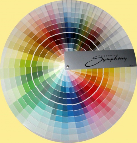
- Tikkririla. The products of this company are designed to obtain the expected result after initial dilution with the base. In total there are more than 2000 tones from this manufacturer. The manufacturer offers a choice of a number of shades for painting facades.
- Natural Color System (NCS) - the color is made according to the standards of Swedish and Norwegian manufacturers. There are only 6 primary colors in the range: yellow, black, red, green, blue and white. Other tones are derivatives of them. Based on the letters and numbers printed on the containers, it is easy to decide on the choice of color.
- Tex is a company that produces pastes based on pigments produced outside the Russian Federation. They are versatile and are used to add color to water-based paints, putties and added to whitewash. Used for interior work and painting of facades.
- Rogneda is a network of Moscow organizations that produces products for artistic purposes and adding tone to paint, plaster or putty. The color of this company is resistant to exposure to the sun and negative temperatures, and also has high adhesion properties.
- Elakr - color for facade paint. It is resistant to negative factors environment and resistance to light. Ideally stored at negative temperatures. Most façade paints are produced on a white base and require diluting to give them color.
Is the color white or not? Basically, the manufacturer produces colored pastes in light and rich colors, but in some cases there is also a white color. It is typically used to provide weather resistance and abrasion protection for advertising lettering and graphics.
Important! Products for water-based paints have gained the greatest popularity, but for other types of paint bases it is not difficult to purchase the appropriate pigment.
Prices for paint colors
color for paint
Sequence of tinting
 How to tint paint at home so that the color matches what you expect? First you need to calculate the amount of material needed to complete painting works in this room.
If there is not enough paint to complete the work, it is unlikely that the same proportion will be maintained again. How to dilute color in water-based paint?
Stages of obtaining color:
- Don't pour a large number of white paint into a small container.
- Then in white base add color little by little, and it is important to record how much coloring matter was added. In this way, the expected shade is achieved. The main thing is to remember how much color was used.
- It is recommended to add the coloring mixture in drops using a syringe with the needle removed. This will make it easier to follow the dosage.
- After obtaining the desired tone, the surface is painted. This is necessary to ensure that the color meets the requirements. Moreover, it is enough to paint an area of no more than 0.5 m2.
- If everything is fine, then you can thin the paint and safely paint the walls. If an unsatisfactory result is obtained, experiment any number of times.
To get a rich color, the color should be added to the paint before painting operations, but no later than 2 hours before starting work. If the time period is increased, the pigments will settle to the bottom and the painted surface will not be as bright as expected.
Important! Wall surface colors are checked for consistency using lighting fixtures. Surface mixing of the color is not suitable, you should mix thoroughly, better with a mixer. The preparation of the paint composition should be done in one container.
Features of the use of colors
Kohler means tone or color (this is a translation from Latin). Depending on the dosage of the added material, the desired shade can be achieved. It is used for painting interior and exterior substrates.
Designed for painting:
- wood surfaces;
- concrete;
- bricks;
- plasters;
- drywall;
- metal
 Suitable for paints based on water-based compositions, oil and alkyd, epoxy compounds, nitrocellulose and polyurethane foam.
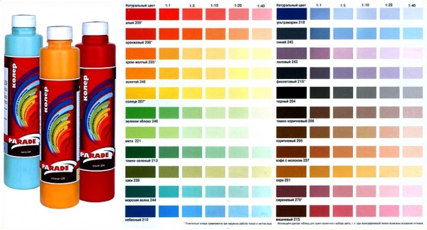
Tinting tablespecially designed to make it easier to choose colors. It indicatespaint and color proportions.
For example, 1:5 means that the color consumption for five parts of the main color is one part. There is no need to add a large amount of material at the same time, since the paint base can be ruined.
To properly perform dilution, you must adhere to the requirements set out in the instructions developed by the manufacturer. The measurements must be the same volume. It is important to know that it is better to purchase paint and color from the same manufacturer.
Is it possible to paint with color? This is a question some people ask. The color is specially designed to impart tonality to the main color; it is rich in pigment. Therefore, its basis is a binder. The adhesion between the surface and the base will be the same as when painting with regular paint. So the color scheme itself to perform painting works It will be possible to use, but it will be quite expensive.
Advice! If the concentrated pigment is not used in full, then the remaining material can be mixed with water. Thus, it will be preserved for at least 5 years.
Useful video: mixing color with paint
To paint surfaces, it is not necessary to choose paint by color; it is enough to purchase a paint base and the desired color tint.
Modern interior design is full of original shades. The range of finished products does not always contain the required halftone. The color mixing table will help you get the desired result at home. The information will be useful not only when renovating an apartment. Knowledge about mixing colors is useful to a wide range of people: novice painters, auto repair workers, decorators and other creative people.
Mixing experiments: what you need to know in advance
The world around us is filled with a wide color palette, but all the colorful splendor is based on three primary colors: blue, red and yellow. It is by mixing them that the desired halftone is achieved.
To get a new shade, use base colors in different proportions. The simplest example of how to get green color. The answer is extremely simple: mixing yellow dye with blue. A visual table of primary, secondary and transition colors obtained by mixing is presented below:
This table will help you understand that the question of how to get yellow is in itself incorrect. It cannot be achieved by combining other components, since yellow belongs to three basic tones. Therefore, when the need for yellow arises, they purchase a ready-made dye or extract the pigment from natural products, which is not entirely advisable.

The same initial colors, taken in different proportions, when mixed they give new result. The larger the volume of one dye, the closer the final result after mixing will be to the original shade.
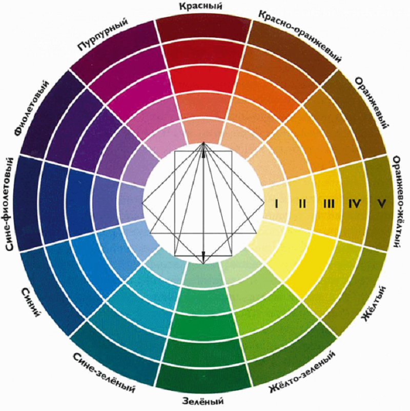
Experiments must be carried out taking into account generally known rules. If you combine chromatic colors that are close to each other on the color wheel, after mixing you get a paint with a pronounced chromatic hue, although it does not have a pure tone. The combination of dyes located in opposite directions leads to the formation of an achromatic tone, in which a gray tint predominates. Navigate in optimal combination The chromatic circle will help you paint:
Attention! Mixing dyes does not always lead to a lasting result. Some paints, when combined, provoke chemical reaction, due to which decorative coating subsequently cracks. There are cases when the desired background turns gray or darkens over time.
For example, if you take red cinnabar and lead white, the resulting bright pink color will darken after some time. It is advisable to take the most limited amount of original paints to obtain the desired tone. When mixing, their compatibility must be taken into account. For example, oil-based dyes are sensitive to solvents. It is better to immediately exclude materials that darken or quickly fade. A table of combinations that should not be used will prevent errors in the creative process:
Variety of shades of red
Red consists of a trio of original colors that make up the base. Therefore, even a minimal set of paints cannot do without it. However, the question of how to get a red color when mixing paints sometimes still arises. This happens because magenta is involved in printing, so creative searches for how to get red are natural. Everything is solved extremely simply: to obtain natural red, yellow is mixed with magenta in 1:1 volumes.
The color scheme of red is diverse, so there are many combination options:

Comment! A beautiful purple color cannot be obtained by combining violet with red. The only way to achieve bright shade– find red paint without yellow impurities and mix it with blue.
The variety of shades of red is demonstrated by the next circle. It is worth noting that adding white colors to any mixture leads to lightening of the tone, and black ones to darkening.

The table below will help you understand the names of shades of red:

Variations of blue
An equally rich palette of shades is obtained by mixing with blue dye, which is part of the basic triad. Therefore, its presence in any set is mandatory. However, even a set of 12 paints sometimes does not meet the needs for true blue tone. The reason is color variations. Classic tone called royal, and on sale it is often replaced by ultramarine, which is characterized by a bright dark shade with a slight presence of purple. Therefore, the question of how to get blue no longer seems absurd. The way out of this situation is to add white to the base color in a ratio of 3:1. Blue is obtained in the same way, only more white is used when combining.
An interesting color of blue with a moderately saturated result is obtained by combining darkish ultramarine with turquoise.

- Equal volumes of blue and yellow dye will produce a dark blue-green tone. The introduction of white promotes some lightening, but the brightness is reduced. The reason lies in the combination of three components, and the more there are, the duller the color turns out.
- To get a turquoise color, mix cyan blue and add a slightly smaller amount of green. This shade is also called aquamarine.
- The color obtained from equal volumes of blue and light green is called Prussian blue. When white is introduced, the saturation decreases, but the purity of the hue does not go away.
- Blue and red colors in a 2:1 ratio produce blue with a hint of purple. The resulting color is lightened by adding white.
- Mixing equal parts of blue and pink magenta will give a royal blue, which is characterized by unusual brightness.
- Blue can be darkened by mixing it with black in a 3:1 ratio.
A table with the names of shades of blue will be an assistant in mixing experiments:

Variety of green
The original green is usually presented in all sets; if the required dye is not available, there are no problems obtaining it. Pairing yellow with blue gives the desired green background. But any direction of creativity, be it painting, interior design or another option for decorating objects, requires a wide palette of green. The basic principle of all experiments is to change the proportions of the base colors; white or black dye is used to lighten or darken the background.
- The combination of blue and yellow with a small addition of brown represents khaki. Green with a small amount of yellow forms olive.
- Traditional light green is the result of mixing green and white. Adding yellow or blue will help regulate warmth.
Attention! The quality of the starting components affects the saturation of the green color. The more intense the base tones, the brighter the blending result will be.
- A yellow-green effect can be achieved by combining yellow and blue in a 2:1 ratio. The inverse proportion will result in a blue-green tone.
- Dark green color is achieved by adding half the amount of black.
- A warm light green background is formed from a mixture of white, blue and yellow paint in a 2:1:1 ratio.
The circle demonstrates a variety of green colors. The base dye is located in the center, followed by the additional component, and then the result of mixing. The last circle is experiments of the resulting tone with the addition of white and black dye.

The next table will become an assistant when conducting experiments.
Other shade combinations
The color kaleidoscope is not limited to combining basic dyes. For example, gray is often required. Different proportions of white and black pigment will give a wide achromatic palette.
How to get ivory color? The base color will be white, with ocher and dark brown gradually added in small portions. Ocher promotes the appearance of warm tones, increasing brown leads to a cold background.
Another table shows the many mixing options:
How to get black? By combining cyan, yellow and magenta. They are not always available, so three basic dyes will help. Combining green with red will also give some semblance of black, but it will not be pure.
Conclusion
Even if you haven’t found a description for any question, tables that not only provide mixing recommendations, but also clearly demonstrate the results of the experiments will help. The results of your own mixing experiments may differ slightly from those stated above, it all depends on the composition of the dye and the surface on which it is applied.
Kirill Sysoev
Calloused hands never get bored!
Content
The mood of the residents depends on the type of living space. Painting has become one of the most popular design options for interior and exterior walls. The choice of paint colors expands the possibilities design solutions, creating an individual interior. What to do if there are no products of the required shade on the market? Then a color scheme is used - with it it is easy to obtain paint of the required color and saturation.
What is paint color?
The word “kohler” is translated from the Latin “color” as color or tone. In the chemical industry, color is a special highly concentrated pigment composition with which you can obtain almost any shade of paint. Moreover, not only water-based products, but also façade, oil, and acrylic products can act as a base. Depending on the concentration of such pigment composition in the paint, you can achieve both rich and bright colors and muted, pastel shades.
The use of color helps property owners make almost any design ideas. The process of mixing and diluting paint and varnish material with pigment is called tinting. Its use is suitable not only for performing finishing works inside the object, but also outside it. Using a special pigment solution, you can obtain unique shades, for example, the paint can be given a copper, pearlescent, bronze, or golden hue.
The color can be used on concrete, brick, plastered walls. Other surfaces can also be treated with compositions using it: plasterboard, wood, fiberboard, chipboard. The use of tinting is necessary in the following cases:
- the original layer has minor defects;
- you need to choose a shade according to color scheme interior;
- you need to decorate the interior using several shades of one or more colors;
- you need to correct errors that occurred when calculating the volume of paint or the absence of a color used previously.

Kinds
When planning to buy a color for water-based, acrylic or any other paint, familiarize yourself with the types of these products. You can order it in a specialized online store with delivery by mail. According to the range of applications, it can be universal, i.e. compatible with any paint and varnish materials, and highly specialized. Colorants are produced in the form of paint, dry composition, paste. The latter option is more convenient to use, but there is a possibility that the intensity finished paint will appear uneven. Based on their composition, the following colors are distinguished:
- With organic pigments. Products of this type are distinguished by a more saturated range of colors, but the paints and varnishes obtained from them lose their brightness and saturation over time due to exposure to sunlight. For this reason, compositions with pigments of organic origin are considered not best choice for facade paints.
- With inorganic pigments. Such products are more resistant to aggressive influences external factors, including burnout. True, this paint color cannot boast a wide range of shades.

You can tint the paint manually or computer-aided. Thanks to the first option, you can save a significant amount of money and perform the procedure directly at the repair site. There is also a drawback: it is almost impossible to reproduce exactly the same tone again. The second type of tinting is controlled through a special program. The operator only needs to select the color scheme, and the program itself will determine the proportions, after which it will produce the finished composition.
When deciding to dilute the pigment yourself, consider the technique:
- Decide on the required amount of color. It is better to initially buy more than to look for identical products later.
- It is recommended to select a color for painting surfaces by making a sample. To do this, fill a small container with 100 mg of white paint and add a few drops of pigment to it. By mixing, obtain the desired shade.
- Check how the resulting composition looks on the wall or other surface that needs to be painted. Not always color ready solution matches the shade of the paint material applied to the wall. The result should be viewed under the lighting prevailing in the room (artificial or natural), after the composition has dried.
- If you know how many drops you had to add to get the desired color, then by recalculating the consumption of the composition per liter of paint, you can dilute and get required amount color scheme
- The pigment composition should be added to the paint and varnish material in a thin stream. At the same time, do not forget to mix everything thoroughly to obtain a concentrated composition with a uniform color.

How to choose a paint color
To begin with, depending on your goals, choose between organic and inorganic products, taking into account the features of each option. Then decide on the state of the color: liquid composition, paste or loose pigment:
- The first option contains the same components as in paint and varnish material(LMB): if you are going to use water-based paint, then the color composition should be the same.
- Bulk pigment is inexpensive, but it has a limited palette.
- Most convenient option– coloring paste.
Choose the right color:
- You can choose a shade using the catalog - it is available in every specialized store. Please note that the shade looks different depending on the lighting.
- If the room where you want to paint the walls is light, then give preference to a synthetic pigment. Under artificial lighting, colors that contain organic substances look great.
- The color scheme of the surface should be in harmony with the background flooring, furniture. If the floor is made in a green-blue shade, then it is better to decorate the walls in a golden or yellowish tone. With brown coating floor surface It is better to make the color for the walls beige.
- The range of wall coverings can be rich and bright: it is known that rich shades can lift the mood. These include lush green, golden, brown or ocher tones. Please note that blue shades in evening light appear more faded than in daylight.
- Please note the manufacturer. Well-known suppliers of colors are Caparol, Monicolor Nova, Colorex, Izhsintez, Decorazza, Unisistem, Olki, etc.
For water-based paint
If you are looking for a high-quality color for water-based paint, then pay attention to the universal dye "Profilux PROFICOLOR No. 18 blue. Can be used for cement plasters, oil-based paints and varnishes. It is cheaper than many other pigment compositions - only 30 rubles per piece. The composition is environmentally friendly , water based:
- name: Profilux PROFICOLOR;
- price: 30 rub.;
- characteristics: country of origin – Russia, volume – 0.13 l, colors – blue, caramel, brown, black, coffee, etc.;
- pros: reasonable price, low consumption, big choice tones;
- cons: none.

Another excellent universal dye option is Dufa D 230. This high-quality diversified dye is made on the basis of synthetic resins. Designed for decorative design internal, facade surfaces. Water is used as a solvent:
- name: Dufa D 230;
- price: 365 rub.;
- characteristics: volume – 0.75 l, colors – red, wood brown, yellow, orange, green apple etc., consumption rate – 0.15-0.20 l/m2, gloss level – deeply matte, density – 1.3 kg/l, application temperature – from +5 degrees, shelf life – 5 years;
- pros: large color palette, high quality, light fastness, resistance to abrasion, lime;

For tinting water-dispersion paints and decorative plasters good option will be products from Tury Scandinavia Classic. Suitable for paintwork materials that are used both inside and outside the object:
- name: Tury Scandinavia Classic;
- price: 206 rub.;
- characteristics: packaging – 1 kg, drying time – about 1 hour, colors – mint, salad, green, lemon, red-brown, pink, beige, etc.;
- pros: low cost, large range of rich and bright colors;
- cons: large packaging.

For acrylic
If you are looking for a suitable color for acrylic paint, then you may be satisfied with PalIzh products. This pigment composition is recommended to be used not only for tinting acrylic paints and varnishes without limiting the percentage of input, but also for painting and coloring small surfaces: concrete, wood, brick, stucco, canvas, etc. More details about the product:
- name: PalIzh;
- price: 211 rub.;
- characteristics: weight – 0.25 kg, drying time – 1 hour, consumption per 1 layer – 150 g/m2, colors – pink, blue, metallic purple, metallic emerald, etc., shelf life – 5 years;
- pros: quality, original colors;
- cons: high cost.

Another good choice would be the universal PalIzh Standard product, used for tinting paintwork materials, wood glazes, plasters and grouts on organic and water-dispersion bases. The product is compatible with paints from any manufacturer. It retains its consistency and properties during several freezing cycles:
- name: PalIzh Standard;
- price: 52 rub.;
- characteristics: volume – 0.1 l, shelf life – 5 years, colors – graphite, gold and silver veneer, sunny, fuchsia, coral, scarlet, dark red, etc.;
- pros: high versatility, saturation, brightness;
- cons: costs more than analogues.

For facade paint
Products from the Faydal brand are perfect for tinting façade paintwork materials. Its pigments are highly resistant to UV radiation, and the color itself is available in 19 bright and rich shades. This product is also suitable for tinting interior paints, putties and plaster masses water based. It can be used for application indoors on mineral surfaces such as brick, concrete, drywall, glass wallpaper, and any type of putty:
- title: FEIDAL VOLLTON – und Abtönfarbe;
- price: 468 RUR;
- characteristics: volume – 0.75 l, specific gravity– 1.4 kg/l, gloss – deeply matte, composition – acrylic dispersion, fillers, pigments, functional additives, water, colors – chocolate, umber, apricot, etc.;
- pros: resistance to ultraviolet radiation, high covering power, original shades;
- cons: bulk packaging.

Another good color for facade paint is JOBI. The product is suitable for the decorative design of facade and interior elements, tinting water-based paints and varnishes, plasters and enamels. Can be used in pure form for stencil and artistic work.
Every person who has ever held a brush and paint in his hand knows that you can get a lot of shades from two or three colors. The rules for mixing and matching colors are determined by the science of coloristics. Its basis is the color wheel known to many. There are only three primary colors: red, blue and yellow. Other shades are obtained by mixing and are called secondary shades.
What colors of paint should be mixed to get brown?
Brown is considered complex; when creating it, you can use all the primary colors. There are several ways to get brown:
- Classic: green + red in proportions 50:50.
- The main trio: blue + yellow + red in equal quantities.
- Mixing: blue + orange or gray + orange. You can vary the intensity of the hue by adding less or more gray.
- Optional: green + purple + orange. This shade has a pleasant red or red tint. You can also mix yellow + purple - the color will have a yellowish tint.

What colors of paint need to be mixed to get purple?
The easiest way to get purple is to mix equal proportions of red and blue. True, the shade will turn out a bit dirty, and it will need to be adjusted.
To make the tone cooler, take 2 parts blue and 1 part red and vice versa.
To achieve lavender and lilac, the resulting dirty purple needs to be diluted with white. The more white, the lighter and softer the shade will be.
Dark purple can be obtained by gradually adding black or green to the original color.

What colors of paint need to be mixed to get red?
Red is considered a base color and is present in any artistic palette. However, you can get red by mixing violet (magenta) and yellow in a 1:1 ratio. You can also mix a carmine shade with yellow to create a more intense red. You can make it lighter by adding more yellow and vice versa. Shades of red can be obtained by adding orange, pink, yellow, and white to the base red.

What colors of paint should be mixed to get beige?
Beige is a neutral and independent color; it has many shades, which can be achieved by varying the amount of white and yellow shades added.
Most easy way get beige - mix brown and white.
To make the color more contrasting, you can add a little yellow.
Flesh beige can be obtained by mixing scarlet, blue, yellow and white. Hue " Ivory"is created by mixing golden ocher and white paint.

Green color can be achieved by mixing yellow and blue in equal parts. The result will be a grassy green hue. If you add white color to it, the mixture will lighten. By mixing brown or black pigment, you can achieve emerald, marsh, olive, dark green shades.

What colors of paint need to be mixed to get gray?
Classic tandem for receiving gray- this is black + white. The more white, the lighter the finished shade.
- You can also mix red, green and white. The color will have a slight yellow tint.
- A blue-gray shade can be created by mixing orange with blue and white.
- If you mix yellow with purple and white, you get a gray-beige shade.

What colors of paint need to be mixed to get black?
Black is a basic monochrome color. It can be obtained by mixing magenta with yellow and cyan. Also, artists often mix green and red, but the resulting shade will not be jet black. Rich black color is produced by a mixture of orange and blue and yellow and violet. To get the shade of the night sky, in ready color You can add a little blue, and to lighten it, a drop of white.

What colors of paint need to be mixed to get blue?
Blue is the main color in the palette and it is quite difficult to obtain it by mixing. It is believed that it can be obtained by adding a little yellow to green, but in practice the result is more of a blue-green tint. You can mix purple with blue, the shade will be deep but dark. You can lighten it by adding a drop of white.

What colors of paint need to be mixed to get yellow?
The basic yellow color cannot be achieved by mixing other shades. Something similar happens if you add green to orange. Variations of yellow are obtained by adding other tones to the basic one. For example, lemon is a mixture of yellow, green and white. Sunny yellow is a mixture of basic yellow, a drop of white and red.

What colors of paint need to be mixed to get pink?
The easiest option is to mix red and white. The more white, the lighter the shade. It is important to know that the tone depends on which red you choose:
- Scarlet + white will give a pure pink color.
- Brick red + white - peach pink.
- Blood red + violet give a fuchsia shade.
- Orange-pink can be obtained by adding yellow paint to scarlet and white.

What colors of paint need to be mixed to get orange?
Orange color can be obtained by mixing red and yellow.
- A less saturated shade will be obtained if pink pigment is added to yellow paint.
- Terracotta orange is the result of mixing base orange with blue or purple.
- Dark shades are achieved by mixing red, yellow and black.
- If you add brown instead of black, you get red orange.
We vary the intensity of the tone by adding more white or black.

Color mixing table
Primary colors (blue, yellow, red) are almost impossible to obtain by mixing other shades. But with their help you can create all color palette!
|
How to get a? |
Proportions |
|
|---|---|---|
|
Brown |
Green + red |
|
|
Violet |
Red + blue |
|
|
Magenta (violet) + yellow |
||
|
Brown + white |
||
|
Blue + yellow |
||
|
White + black |
||
|
Magenta + yellow + cyan |
||
|
Yellow + green |
||
|
Green + orange |
||
|
Scarlet + white |
||
|
Orange |
Red + yellow |
Knowing the basic rules of color, it will be easier to understand the decoration and get the desired shade!
Whatever wide selection The color range of paints in the store is sometimes not enough. In this case, tinting will come to the rescue - mixing a light base paint and a colored pigment. This allows you to get a wide variety of colors and shades.
Types of tinting
Now it is possible to perform computer tinting of paint. You just need to select the desired shade, and the paint tinting equipment will accurately calculate all the proportions for the mixture.
The big advantage of this method is the ability to repeat the result if necessary. When mixing paint by hand, it is unlikely that you will be able to get the same color. But independent tinting makes it possible to evaluate how the paint will look directly in the room and, if necessary, make adjustments.
Shade selection
When choosing the desired paint shade, there is a whole group of factors to consider. Paint can look very different during the first test strokes and when the entire surface of the walls is already painted.
Lighting also has a significant impact on color perception. Too much bright light can visually discolor bright colors. At dusk or in low light they will appear duller and gloomier. Warm or cold light lamps can give the paint a yellowish or blueish appearance, respectively.
Picking up desired color according to the paint tinting spreadsheet, it is important to remember that even monitors with good resolution and color display will not be able to convey 100% accurately real shade paints.
When choosing wall colors for a living space, it is better to give preference to softer and calmer shades. The kitchen and hallway can be painted in brighter and richer colors.
DIY tinting
If tinting paint is done manually, then it is better to do it in the room in which it will be used. This will help you achieve perfect suitable color precisely in the lighting conditions of a given room.
When tinting paint with your own hands, you should remember that no matter how hard you try to remember the proportions, you will not be able to perfectly repeat the same color a second time; the differences will be noticeable to the naked eye. Therefore, the paint must be diluted in a large container so that there is enough for the entire room at once. To the paint consumption indicated on the packaging for 1 square meter It’s better to add 5-10% in reserve.
Advice ! You can make the process of selecting the right shade easier by downloading a paint tinting program.
It is advisable that the white paint and color be produced by the same company. Manufacturers may have significant differences in paint production technology and its composition, so it is better not to take risks, otherwise you may end up with a coating not only of a strange color, but also with poor performance characteristics.
Important! You should only use paint specifically designed for the surface. Products for ceilings, walls and floors have completely different indicators of soiling, wear resistance, etc.
As a rule, a paint tinting table is included with the color scheme, demonstrating the possible proportions of mixing colors.
Large manufacturers, for example, Tikkurila, offer customers entire catalogs of paint tinting, available in paper and electronic form.
To stir the paint, you must use a mixing attachment on a drill or hammer drill, since long and thorough mixing of the mixture by hand will still not give a uniform result. The paint is mixed until a mass of uniform color and density is obtained.
The color of the paint in the container may differ slightly from what you get when applying it to the surface. To see how this shade will look on the wall, you should prepare a test mixture (trying to remember the exact ratio of components), and then paint small area and wait until it dries at least a little. Although even if the proportions are observed the second time, it will not be possible to obtain absolutely identical colors, a test coloring will still help to get a rough idea of the result. It should be remembered that as it dries, the color of the walls will become somewhat less bright and saturated.
If you don’t like the resulting color, you can change it by adding either a little more color or, conversely, white paint. If water-based dyes were used, the mixture can be diluted with water.
Advice ! If the color is in an inconvenient package, from which it is difficult to add it to the paint in small quantities, then it will be convenient to use a regular syringe.
Types of colors
The composition of dyes can be organic or inorganic. The first type allows you to get brighter and more saturated shades, but over time this coating noticeably fades. Inorganic colors are presented in a much narrower range of colors, but are resistant to weathering and ultraviolet radiation.
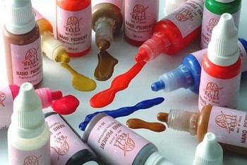
Colors are available in the form:
- Pastes;
- Dry mixture;
- Liquids.

Dry dyes have the most favorable price of all three types. Among their main disadvantages is a small selection of colors and the difficulty of accurately adjusting the shade. Before adding to the white base, the powder must be diluted in a liquid suitable for its type - water, drying oil, etc. and mix thoroughly.
Liquid dyes are most convenient to use. They allow you to change the shade of color very effectively. You should choose colors in accordance with the type of paint in the room (water-based, acrylic, oil, etc.). If some area of the surface needs to be selected color accent, then the color can be used even undiluted.
Although color pastes are convenient to use, they themselves may have an uneven color. As a result, when mixed, you may end up with an unexpectedly light or dark shade. When using them, it is important to observe the proportions - the amount of paste for a certain volume of base paint should not exceed that specified in the instructions.
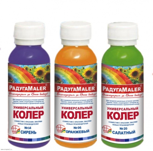
- Both Russian and foreign manufacturers They have a large selection of types and shades of colors. Domestic paints not only have a better price, but are also not inferior in quality, so there is no point in chasing expensive foreign products.
- It is recommended to use snow-white rather than just white paint as a basis for tinting. The latter often has a yellowish tint, which can greatly affect the tinting result.
- Don’t get carried away and pour half a bottle of dye into the base at once. Even a few drops of color can already noticeably change the color of the paint.
- Colorants can be used not only to obtain the desired shade of paint, but also added, for example, to plaster.
note! Many people mistakenly call tinting any mixing of paints of different colors.
However, there are two concepts for this action:
- glazing - if two are mixed different colors to create a third (for example, yellow and blue to create green);
- tinting - adding a coloring agent to white paint.
Surface preparation
Before painting, it is important to clean the wall from dirt, traces of the previous coating, mold, etc. If the surface is uneven, it is better to plaster and sand it. It is also important that the wall covering to be painted is also white, because the dark background will be noticeable even through several layers of paint. For better adhesion (adhesion) of the dye to the surface, it is recommended to use a suitable this type paint primer.
Advice ! You should carefully read the instructions, recommendations for use and proportions of components indicated on the packaging.
This will allow you to avoid unpleasant surprises in the process of tinting wall paint and painting and get the desired shade without much difficulty. And the video instructions will explain in detail how to tint the paint without mistakes.