Painting walls in the interior makes the room not only attractive, but also creative with the help of a wide range of decorative techniques. Wall design ideas are not limited to plain paint, structural paint and other original decor options will create a beautiful interior.
Pros and cons of painted walls
At first glance, this is the simplest type of wall decoration; the market offers a wide selection of types of interior paints that do not have unpleasant odor and dry quickly. There are features to consider when painting walls.
Advantages:
- large selection, use of colors;
- no harmful fumes when paint dries interior decoration;
- You can paint the walls yourself;
- simple decoration can be made using a template and a texture roller.

Flaws:
- The preparation of the walls causes great difficulty;
- emphasizes the unevenness of the wall;
- When repainting, the previous layer will need to be removed.

On the picture gray bedroom with a brick wall and smooth plastered walls, the red decor is a bright accent of the interior.
Types of paint
Alkyd paints
- Alkyd resin paint, used for painting wood and metal, plaster. After drying, they do not harm health, do not allow moisture to pass through and do not change color.
- Oil paint takes a long time to dry due to its oil base on drying oil, and is used for outdoor work due to harmful fumes. Over time, yellowness in color appears.
- Enamel has a distinct gloss due to the varnish base, and is used for painting any surfaces indoors and outdoors. Protects against corrosion and is resistant to light and humid environments.

Emulsion paints
They are economical to apply, can be used on top of other types of paints, and do not have an unpleasant odor.
- Acrylic is applied to well-dried walls, suitable for painting walls in rooms with low humidity. It lends itself to good tinting and retains its color even under the sun. Does not allow steam and moisture to pass through, and is resistant to mechanical stress better than others.
- Latex is resistant to washing and rubbing, dries quickly, hides small cracks, used for painting wallpaper, plaster, brick. May change color when exposed to sunlight.
- Water-based Over time, it loses its brightness due to color washing off, is suitable for creating relief and texture, has high strength and hides small cracks, reinforcing them.
- Silicone based on silicone resins has high plasticity, forms a waterproof film, hides small cracks, and can be applied to any surface. Compatible with other emulsion paints and does not allow the development of bacteria.

Textured paint
Looks unusual compared to ordinary painted walls, suitable for interior decoration and creating unique interior. It comes on a mineral, silicone, acrylic basis.
Apply with a sponge using a blotting motion, if the area to be painted is small, with a textured hard roller with teeth, a glue comb, or a metal spatula. The relief is created by filler particles.

Combination with other materials
In the interior, 2-3 types of wall decoration are often used to diversify the design.
They can be combined in the case of finishing the ceiling with wallpaper and the walls with paint, creating an accent on a painted wall, or combining bottom - paint, top - wallpaper. There are also special wallpaper for painting, which can be repainted several times.

Used in the kitchen, hallway and toilet. The walls are exposed to moisture, so photo wallpaper is used for decoration.

In the photo there is a bedroom interior with photo wallpaper and neutral walls, the podium serves as a closet.
The plaster can be painted on top of the bark beetle, which will give relief to the walls, or combined with painted adjacent walls in the interior of the toilet, kitchen and hallway.

A wooden wall made of beams or laminate is combined with plain wall painting in the interior of an attic, living room, or country house.

Suitable for decorating a fireplace wall in the interior of a living room, country-style kitchen or chalet, where the apron is made of piece stone and the rest of the walls are painted in a single color or a transitional color. Brick and painting are suitable for finishing a kitchen in Provence or loft style.

Brick and painting
The brick can be white or red, and the paint can match the brick, or differ in color.

On the picture
3D panels are suitable for simple, but unusual design interior Plain walls with voluminous panels are suitable for discreet and stylish design, and two-tone painted walls with colored panels look good in a nursery or in an abstract interior.

Design options
Plain walls are chosen for discreet interiors, such walls serve as a neutral canvas for expressing style in pieces of furniture and accessories.

Painting in two different colors
Painting walls with two different colors serves as a rational technique to visually enlarge a room, change the perception of the geometry of asymmetrical walls, or simply focus on one wall. One wall can be painted with two different colors.

Painting in different colors (more than two)
Painting with several colors in the same range or a combination of contrasting colors will become an independent decoration in the interior. This could be stripes, vertical or horizontal separation of walls, or painting all 4 walls in different colors. Within one room, it is better to make one color the main one, and leave the remaining 2-3 colors as auxiliary ones.

In the photo, one of the walls is painted with three colors in uneven stripes using a geometric technique using masking tape.
Stencils
You can make your own designs using stencils and templates by cutting them out of paper and attaching them to the wall. You can also draw boundaries for the design using masking tape glued to the dried base color.

Striped design
Stripes of paint stretch or expand walls and change the perception of a room depending on the location, color and frequency of the stripes.

Patterns and ornaments
Suitable for a child’s room, you can draw a house, a fence, trees, ethno ornaments, monograms on the walls of the child’s bedroom interior.

Divorces
They can be organized or chaotic, created with a brush on wet walls.

Cracks or craquelure effect
Created using acrylic painting and craquelure varnish, the more varnish, the deeper the cracks. When applying, the roller must be held vertically so that the cracks are uniform.

In the photo, the accent wall of the bedroom is made using the technique of cracked paint with a backing that matches the tone of the walls.
Under the brick
An imitation of brick can be made using plaster on a lined wall and traced seams along the wet material. After the plaster has dried, apply 2 layers of paint.

Painting with squares
Can be done using templates or masking tape. Squares can be plain or colored, of different sizes and positions on the wall.

Texture design
It is created by painting walls with textured paint, which contains acrylic particles and starch. It comes in dry and liquid states, and can also be tinted. Apply with a regular or textured roller. For interior design, special textured paint for interior work is suitable.

Gradient and ombre
Suitable for visually enlarging the ceiling if the dark color near the floor fades into white. Gradient or smooth transition colors can be horizontal or vertical, with a transition to the adjacent wall. It is created with 2 or more colors, where at the junction of the colors, using a dry roller or brush, the dark color is stretched onto the light area in one direction.

The photo shows a partition wall painted using the ombre technique with a smooth, smoky transition of gray to white closer to the ceiling.

Using a textured roller or sponge
Effects using a textured roller or sponge are made on a uniformly painted wall, creating the effect of watercolor, bark beetle, waves, cracks, velor or mosaic.

painting
Artistic painting using ethnic techniques, depicting a view of nature, animals and reproductions will become an individual feature of the interior with wall painting.

Design with moldings or panels
Creates the effect of niches or furniture facades, adding volume. Molding can be colored or white, made of wood, duropolymer, or gypsum.

Wall painting color
White
Often used independently in Scandinavian and other modern interiors, it is also a companion for bright, warm and cool colors.

Beige
Does not draw attention to itself, acts as a background for furniture, is used in classical and modern design. Combines with white, gold and black paint.

The photo shows a kitchen interior with a white matte set and beige walls, where light laminate matches the paint tone.
Brown
Brown in the shade of coffee, chocolate, with the texture of wood is combined with other natural colors and stone in the interior.

Green
Green in shade of ocher and pistachio color soothing, suitable for bedrooms and living rooms. Light green and herbal are bright colors, suitable for children's and kitchens. Combines with raspberry, brown, yellow, white.

Grey
It is the background for loft style and modern interiors, combined with red, black and white, carrot-orange.

Blue
Ideal for a bedroom, children's room in classic and nautical style. It is also a common bathroom wall color.


On the picture gray-blue interior With plain walls and classic shelves. A green accent brightens up the living room.
Blue
Suitable for southern rooms with plenty of summer sunlight, combined with green, white, blue and red.

Yellow
Yellow for sunny interiors or rooms with poor lighting, combined with orange, green, white.

Lilac
Creates a Provencal atmosphere in the kitchen, is suitable for any room and combines with natural pastel colors.

Violet
As a magical amethyst, it attracts attention to the interior; it is used in spacious rooms or combined with white painted walls.

Red
As the most active and energy-independent color, it does not need to be supplemented, but if the apartment is small, then it is better to combine red with gold, beige, and white. White furniture or furniture looks good against its background.


The photo shows a two-tone paint job with an accent red tomato-colored wall, which has shelves and a chest of drawers made of natural wood.
Orange
Like yellow, it adds color to the interior and combines with all shades of green, black, and gray. Used for balcony, bathroom, hallway.

Pink
Pink in pale shades is used for the interior of a bedroom, children's room, stripes and designs are painted with it using a stencil. Combines with pale blue, white, black, lemon.

Black
In the interior it often acts as an outline or as a pattern, a companion color; it is used independently in large rooms and acts as a background for light-colored furniture.

Features of painting walls of different materials
Wooden walls
Painted wooden walls not only look aesthetically attractive, but also extend the life of the wood. Before painting, the old coating must be removed from interior doors or walls made of wood and treated with stain. After drying, apply 1-2 layers of alkyd or acrylic paint.

The photo shows a wooden panel painted pale yellow in a classic bedroom interior with a gray baseboard and light floor.
Brick walls
Before painting, they clean and wash with water; after a week, all the moisture will be released and it will be possible to prime the surface and paint the brick with interior acrylic or alkyd paint. You can age the brick or create smudges. You can use a contrasting color for the seam.

Concrete walls
Before painting, you need to clean it, make the surface smooth and free of cracks, prime it, let it dry and apply epoxy or latex. A repeat layer must be applied to the entire surface of the wall at once to avoid changes in shade.

Wallpaper
Paintable wallpaper is convenient in that it can be repainted without driving pigment into the walls. Such wallpaper can also be removed without sanding or cleaning the surface. Wallpaper paint is water-based without solvents. Textured wallpaper make work easier and hide uneven walls.

Drywall
Drywall on a wall or ceiling is painted after filling the joints and all the drywall, as well as sanding and priming. They use acrylic or silicone paint, which are plastic and create a protective film.

Plaster
Painting on plaster takes place on a clean, dry surface. If chips are noticed during the preparation of the wall, they need to be cleaned and sealed. Painted with a roller in 2 layers with maximum filling of pores.

Photos in the interior of the rooms
Kitchen
The kitchen, as a room where you need to wipe the walls, needs water-based painting with acrylic or latex paints. For kitchen interior Neutral colors, contrasting or matching the headset are suitable.


Children's
A children's room can have the walls painted with special paints marked; they are water-based and dry quickly. There are also paints with silver ions, which do not absorb moisture and allow you to paint over regular watercolors. Colorful stencil designs, stripes, patterns, letters and numbers are all suitable. The interior can be easily replaced by painting the walls a new color.


Living room
The living room as a platform for creativity can combine stone finishing and painted walls, several colors and different designs. Water-soluble, textured painting or a combination of colors in the interior are suitable.


The photo shows the interior of the living room with wooden ceiling and plain light walls in a country style with an emphasis on furniture from different categories and color palettes.
Bedroom
The bedroom is distinguished by a calm atmosphere and a cozy interior, so you need to choose neutral, natural colors. Best avoided in the interior bright colors or use them as an accent on the wall at the head of the bed. Stencil design, textured painting, stripes and ornaments are suitable.


Bathroom and toilet
The bathroom and toilet, as wet rooms, should be painted with acrylic, latex, or silicone paint. Painting with oil-based materials is not recommended due to the long drying time and harmful odor. You need to paint those areas that are not exposed to water; the area near the sink and bathtub should be tiled.

Traditionally, a combination of blue and white, white and orange or yellow is used in the interior. For the toilet, painting can be combined with vinyl or photo wallpaper.


Balcony or loggia
The balcony or loggia must be protected with paint from corrosion and fungus. For the interior of an open balcony or loggia, which is separated from the apartment, only paint for exterior use is suitable. For wooden lining will fit water-based paints, for brick or plastic - varnish.

It is often stuffy on the balcony, so a cool color palette is suitable, white and orange are also used. When painting, it is important to choose a sunny day with no rain forecast.


Hallway
The hallway or corridor can be painted using the ombre technique with an orange transition to a white ceiling. Water-based paints of light shades are used, combination with decorative stone or textured plaster. Narrow corridor can be expanded with 2-3 horizontal stripes.


Design styles
Modern
The style uses single or two-tone wall painting, combining white with another color. The children's interior uses bright details in stripes and patterns on the wall. The emphasis is on practicality, so an unobtrusive palette and combinations are used.

Minimalism
Minimalism is observed in monochromatic painting, a combination of gray or pale blue with white, and decor with wide stripes. Sometimes contrasting molding or textured paint is used in the interior.

Loft
The interior is not limited to a specific color palette; the design is often used only on an accent wall. Brickwork can also be painted using ombre technology.

Classic
In the interior it is expressed in a neutral light background with golden, white monograms, in blue or black patterns, which are emphasized by tassels and fringe on velvet curtains of emerald or ruby color.

Provence
Provence or French summer gloss of the interior is recognizable in pink, mint or blue walls, olive shade of curtains and textiles. The walls in the interior can be painted plain or striped. To create individuality, you can make an artistic painting on the wall in the form of an open window onto the summer Provencal fields.

The photo shows a turquoise bedroom in the Provence style with plain painted walls, classic furniture and floral textiles.
Country
The interior uses a combination of natural timber or stone with brown, mustard, white paint with a whitewash texture.

Scandinavian
The interior is as practical and light as possible, so the walls are creamy, white, less often sandy, blue color. Stripes, molding, 3D panels, and a white brick wall are suitable for decoration.
Painting walls as one of the types of finishing is used not only for external, but also interior work thanks to paints that are odorless, dry quickly and are not harmful to health.
Photo gallery


When deciding what color to paint the walls in different rooms of a house or apartment, you need to take into account many nuances and rules. Following the existing recommendations will allow you to get an attractive and harmonious room that will not cause discomfort. When choosing a shade, you should pay attention not only to classic, traditional solutions, but also evaluate the options offered by the teachings of Feng Shui.
All colors are conventionally divided into three categories:
- Cold. This group includes violet, green, blue, blue gamma. Suitable for brightly lit rooms located on the south side.
- Warm. Includes a yellow, red, orange palette. Are great solution for the north side with insufficient natural light.
- Neutral. Traditional grey, white and black shades.

Each option has a specific effect on a person’s emotional and mental state. Some tones can cause aggression and anxiety, while others, on the contrary, relax, put you in a calm mood, or promote creative and business growth.
Secrets of successful choice
When choosing color range Individual preferences are paramount. But to make such an important decision, you can use recommendations that allow you to more accurately assess all the nuances.
General rules:
- Purpose of the premises. Each room in an apartment or house most often has certain functions, which influences the interior design and the color of paint for the walls. An example would be a bedroom, which should set you up for a good rest. The presence of black, variegated or brightly alternating shades in such a room will not give harmony. Even in one-room apartment the space is divided into zones.
- Surface texture. At finishing works The general design of the interior is determined in advance, so it is immediately clear what kind of relief is on the walls. If the coating is traditionally smooth, then there will be no special problems. But with the texture achieved by using special putty or paint, the real visual perception will be different. The fact is that even small irregularities cast shadows under different light sources.
- The wider the choice, the more difficult the decision. The modern palette of colors is very diverse, so initially you should focus on several basic colors, but no more than 8–12 ( larger number shades will complicate the task). You need to choose based on samples that were actually painted, and not from catalogs or booklets. Naturally, this will not create a complete picture of saturation, but it will protect you from errors that arise due to incorrect color rendition of the drawings printed in the printing house.
- The secret of designers is the rule of three. All colors are usually divided into two groups: chromatic and achromatic. The first option includes bright shades: blue, green, red and others, the second option includes calm shades: black, gray, white. According to the rule, it is recommended to combine no more than three chromatic colors in one room. This does not apply to achromatic ones.

But even following all the rules and a good imagination will not give a real idea of what the wall will look like in the end. To do this, a test painting of an area of at least 1 m2 is done, completely repeating the technology. Naturally, such an event is not always possible.
Important! Strict adherence to the manufacturer's instructions on the label or in a separate brochure is a must.
Perception of color palette
Any professional designer knows that every color on an unconscious level affects emotional perception. A person may feel constantly tired or irritated and blame it on everyday circumstances, although the reason is the wrong color of paint.

It is advisable to take into account following features various shades:
- Red . Has a stimulating effect. In small quantities it can stimulate positive processes, but in excess it causes aggression and irritability. Constant contact with this shade leads to fatigue and psychological devastation.
- White . Universal color, which can make the space more spacious and relieve the feeling of tension, but in large quantities will lead to the opposite effect. In addition, it evokes associations with medical institutions.
- Yellow . A small amount of this color gives confidence, creates cozy atmosphere, and excess sets one in an anxious mood and generates mistrust. A similar effect has Orange color.
- Blue. Promotes peace. The predominance of this shade does not have such a detrimental effect, but it can interfere with getting into a working mood.
- Green . Creates associations with trees and vegetation. Gives strength, invigorates and helps you focus on the task at hand.
- Black . The color of rigor and tact is responsible for maintaining solidity, but excess leads to depression.
To avoid making a mistake in your choice, you should follow simple rules:
- Everything is good in moderation. This postulate is valid for any palette of colors.
- Natural shades are the most correct. You can use it as much as you like and get amazing combinations, but everything you need already exists in nature.
- There are a great many professional craftsmen and designers, but everyone has their own idea, so their advice should only be of an auxiliary nature.
When combined various colors A preliminary compatibility assessment is carried out. To do this, you can be guided by individual perception or use special color tables.

Fashionable colors of 2018 and the first half of 2019
To choose the right range of shades, you can use the trend of 2018 and the trend that remains in trend in the first half of 2019.
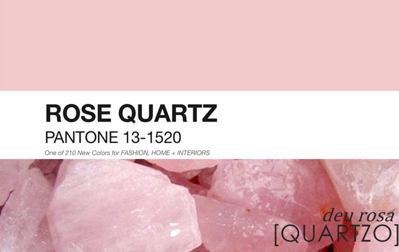
- Rose Quartz. Otherwise – rose quartz. This color emphasizes nobility and allows you to tune in to a calm mood. Being universal for all rooms, it is diluted with purple or pearlescent shades.
- Greenery. Light green color, which is quite a popular solution. It can become a real decoration of any interior; it can be combined with many tones, but it gravitates more towards natural ones.

- Iced Coffee. Iced coffee is perfect for modern (high-tech) and classic interior styles. Gives a feeling of comfort and style. Diluted with peach dye.

- Hazelnut. A universal color that will fit perfectly into any space and become an indispensable companion for all shades. To enhance the effect, you can use orange or pink accents in the interior.

- Serenity. Blue-lilac color is back in trend. Blue is the main color and gives depth to the room, while lilac gives expressiveness. Combine with rose quartz or peach shade.

- Flame. Orange-red color, resembling a flame - this is an option for strong and confident people who are constantly on the move. Suitable for placing accents, combined with moderate shades.

- Peach Echo. The soft peach color remains the same an elegant solution For exquisite interior, whose furniture items are selected with special taste. This wall painting is complemented by dark accents and paintings. It is most successfully used in living rooms, bedrooms and children's rooms.

Painting walls in different rooms
Individual preferences when choosing suitable color for the walls in the room are dominant, but to achieve an optimal result, some recommendations should be taken into account.
Hallway
This room in most apartments and houses is very modest in size, so the optimal color for such a room would be light (beige, Ivory, orange) with possible brighter accents. Due to this, the hallway will seem much larger.
Corridor
If the corridor is narrow, then several shades are used to paint it, which are recommended to be placed in the form of horizontal stripes. An interesting solution would be to create black central or side borders. The main color can be gray, light brown, beige.
The photo shows a corridor in beige shades; this color is considered the most used in such rooms.
 Corridors usually do not have enough daylight, so the main palette of paints for walls should be light colors
 Living room and hall
Provided that all residents constantly gather in the room, blue, light blue, purple and pink shades are optimal. They are complemented by gold, red and gray colors. For a room used in other situations, a more austere interior with a predominance of cool colors is selected.
Children's
Choosing paint for a nursery is more difficult, since you need to take into account the preferences of the child or teenager. Gender also plays a significant role: boys gravitate towards bright and complex color combinations, while girls prefer calm pink and beige shades with rich splashes. Naturally, such an interpretation is often conditional, therefore, taking into account the wishes of the child the best option is the use of natural colors and their shades.
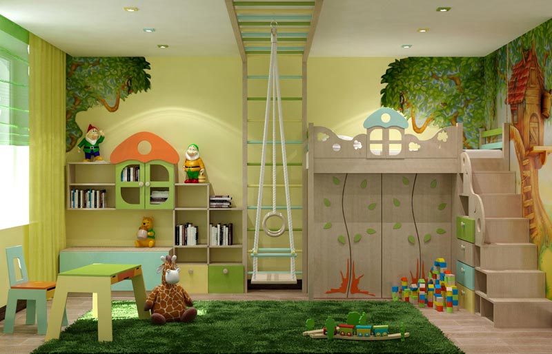
The photo shows a children's room in yellow-green color. This combination is an excellent solution for a child’s room, as it has a positive effect on the visual system that has not yet become stronger, gives energy and at the same time calms nervous system.
Bedroom
This room should promote relaxation and comfort, so the walls can be painted in shades of yellow, orange and green. It is better to abandon newfangled and experimental solutions that may look good on paper or in pictures on the Internet, but in reality they create an absolutely depressing impression.
Kitchen
If there are pieces of furniture in bright colors, then the walls are painted in a contrasting tone. If the kitchen modules have natural colors in the classical interpretation, similar lighter or darker shades are selected. But to create a modern interior, the walls can be painted in bright colors: red, orange or indigo.
Cabinet
Brown, gray and beige shades are suitable for this room, which can be complemented by black accents. Everything should be in a calm and business-like manner. Modern offices for creative individuals are best painted green, red and blue or combinations thereof.
Bathroom
Bathrooms big size are rare, and many of them include several zones, so individual colors are chosen for each area. Blue, purple, dark blue and light green shades interspersed with red or black are well suited for such a room.
 The bathroom is associated with water, so blue and its shades are most often chosen to paint it.
 The main thing when choosing the color of a room is to consider general style houses or apartments.
The influence of shade on the visual size of a room
Each shade affects not only psychological perception, but also visual one. Correct color for wall surfaces allows you to expand or narrow the room.
Coloring principles:
- It is better to decorate small rooms with calm, light colors, thereby enhancing artificial lighting and visually expanding the area.
- To high ceilings seemed lower, you can paint the walls in pastel shades, and the ceiling itself is darker. This combination will increase the overall space.
- Desaturated green and blue visually expand the room.
- Relief moldings painted in the same color will help to enlarge the wall.
- At small area rooms should abandon provocative solutions and a combination of many tones. This completely eliminates the feeling of space due to the inability to concentrate. Also not the best solution will art painting, especially with large elements.
- To make large rooms smaller, orange and red shades are used, and to emphasize their status, deep gray and dark shades are used.
On a note! Since it is impossible to perceive all combinations, it is worth resorting to the use of special graphic programs. Color modeling in them is not always completely reliable, but it allows you to catch a good combination or reject a bad one.
Choosing colors from a feng shui point of view
Feng Shui is a Taoist practice responsible for organizing space. Based on this teaching, each element has its own color:
- water (north) – black;
- earth (northeast, southwest, center) – brown;
- tree (east, southeast) – green;
- fire (south) – red;
- metal (west, northwest) – white.
 Bagua - map of feng shui zones
 According to this eastern practice, common in Asian countries, each color has a specific effect on a person and is used for different rooms:
- Yellow . Symbolizes the sun, abundance and wealth. Creates a feeling of fun, comfort, strengthens hope and binds a person to home. Not suitable for dark rooms and bathrooms.
- Red . It is responsible for vital energy, therefore it is recommended for the construction of offices, but its excess leads to the opposite effect. Suitable for delimiting space and zoning. Should not be used in rest areas, hallways or bedrooms.
- Blue . A mysterious color that develops a sense of adventure and exploration. Suitable for living room, bedroom and office areas. A bad solution would be for the kitchen, hallway and corridor.
- Green . The basis of a new life, correct activity, but light shades talk about possible immaturity. Used for children's and teenage rooms, great for purposeful boys and girls.
- Orange . Can act as an additional color in the living room or short-term recreation area. You should not paint walls in offices and bedrooms with it.
- Peach. Symbolizes calm and is responsible for romantic appeal. Suitable for a room where a teenager lives, especially a girl. A slightly diluted shade is used to paint the living room and bedroom.
- White . Symbolizes purity and openness. It is used for walls in the nursery and living room and for highlighting areas in the kitchen.
- Black . Responsible for strength and solidarity, helps create intrigue. It is recommended to use shades of black that are suitable for certain areas of the walls. Not recommended for children's, teenagers', work or recreation areas.
Due to the fact that modern interpretation This practice has undergone changes; many meanings have been completely adapted to current conditions and have lost their original meaning.
Mistakes when choosing a color palette for walls
Mistakes when choosing paint colors that cause psychological discomfort:
- The period of illumination is not taken into account. IN different time days daylight may change, so great importance has the presence of artificial light sources.
- The overall perception is influenced by all the details, and especially the furniture: a sofa, armchairs, tables, cabinets should match the main tone or contrast.
- Feng Shui takes into account the combination of colors, because the practice is based on the endless movement of space. A bad solution would be to use yellow and green, red and black, yellow and blue in the same room.
But most problems arise from the fear of making mistakes. You cannot please everyone or adapt to every opinion and recommendation; it is individuality that creates harmony. An example is the conditional ban on painting small rooms dark: if you choose a certain shade, the result can be stunning.
When working on interior color design, you need to solve several problems at once. It is necessary to take into account the influence of color on the mood behavior of the inhabitants of the home, the psychological perception of shades of colors, the influence of color on the awareness of space in a particular color scheme. Imagine how a combination of colors will maintain harmony in the interior and create comfort and peace.
The combination of colors will maintain harmony in the interior and create comfort and peace.


The construction industry offers such a multitude and variety of finishing materials of different shades that a traditionalist, a lover of risky solutions, and a modernist can realize the dream of a home in which you can rest your soul. You should start with visualization. Enter the room and look around.
The interior of the room can be decorated as a complex (all rooms in the same style) or detailed. The color of the floor, ceiling, walls, baseboards, doors, windows, furniture, carpeting - everything is important.

You should start with visualization.

White doors and baseboards with dark floor shades create additional air in the room and soften the accents.
Light colors and shades in the living room and bedroom will visually increase the space. It will always be here good mood, tranquility, complete rest. In north-facing rooms, use sunny yellow.
Delicate pastel combinations of the floor, walls, and ceiling in the nursery calm, develop creativity, and pacify. It's good to play and run in the red room, but it's impossible to sleep.


The interior of the room can be decorated as a complex (all rooms in the same style) or detailed.

White furniture looks stylish and noble in a room with dark floors and walls, and a light ceiling.
In the blue and white kitchen, hunger is satisfied in small portions. And where yellow, orange and green predominate, it eats excellently.
Dark colors in the room will visually reduce its size. A dark ceiling will make the room appear lower.

The color of the floor, ceiling, walls, baseboards, doors, windows, furniture, carpeting - everything is important.

You should try to choose the color of the furniture so as not to end up in a gloomy room that is depressing.
What does the color say?
- Red is about sexuality, tension.
- Brown is depressive.
- Gray – sad.
- Blue – uncomfortable, sleepy.
- Yellow – sunny, joyful.
- Green – vital, cheerful.

Light colors and shades in the living room and bedroom will visually increase the space.

The purpose of the room dictates the choice of color.
Color addiction
The right combination of colors can work wonders. For example, choose the color of the floor. We focus on the walls and ceiling.
- A dark floor made of natural wood (parquet, boards) or laminate in a room with white walls and ceiling will visually make the room larger.
- A dark floor, dark ceiling and light walls will remove height and stretch the room.
- Light floor color light wallpaper, a white ceiling will raise the height of the ceilings.
- A light floor, dark walls, and a light ceiling will flatten the room.

In north-facing rooms, use sunny yellow.

For example, choose the color of the floor. We focus on the walls and ceiling.
In the kitchen, the color of the floor depends on the thematic focus: country style, modern, classic. Choice of material – white or colored tiles, natural wood beige, brown, red tones, plain or patterned stone, even concrete - will emphasize the individuality of the owners.

Delicate pastel combinations of the floor, walls, and ceiling in the nursery calm, develop creativity, and pacify.

It is necessary to choose colors so that they do not tire, quickly become boring, or irritate.
Look good dark colors floors, baseboards and doors chosen for contrast - in rooms with light walls and ceilings. White doors and baseboards with dark floor shades create additional air in the room and soften the accents.

It is necessary to choose colors so that they do not tire, quickly become boring, or irritate.

Dark colors in the room will visually reduce its size.
White furniture looks stylish and noble in a room with dark floors and walls, and a light ceiling. Black floor color is a fashionable trend in color design of late. Here you need to try to choose the color of the furniture so as not to end up in a gloomy room that is depressing. Heavy black will dilute fresh white. The purpose of the room dictates the choice of color. This color set is good for a home office or a small living room. Looks unusual and bold dark hallway with white furniture and door. A black bathroom floor requires space, white walls and ceiling.

The right combination of colors can work wonders.

It is necessary to take into account the influence of color on the mood behavior of the inhabitants of the home, the psychological perception of shades of colors, the influence of color on the awareness of space in a particular color scheme.
Color compatibility table
Each person has his own stable, formed tastes. Fashion is fashion, but living in a house whose walls are full of fashionable 3D wallpaper, but you still like painted wallpaper or with a small, unobtrusive pattern, will quickly become uncomfortable and you will want to redo everything. But how? To be stylish and original. If you are in doubt, the designers have developed a table of color combinations in the interior.
When the choice of a single color design does not suit you, use the compatibility table. Experts have selected harmonious combinations two, three or more colors that do not strain visually, relieve psychological stress, and will look fresh and fashionable for a long time.
Lovers of contrasts need to know such pairs. For example:
- red is opposed to green;
- lilac – light yellow;
- orange – turquoise;
- blue – rich yellow;
- purple – light green.

Each person has his own stable, formed tastes.

Experts have selected harmonious combinations of two, three or more colors that do not strain visually, relieve psychological stress, and will look fresh and fashionable for a long time.
And vice versa, you will not be accused of bad taste if you are one of the dominant ones in the interior:
- add a little pink and purple to red;
- blue – turquoise, greenish, lilac, purple;
- green - young light green, blue, turquoise;
- yellow - orange and light green.

When the choice of a single color design does not suit you, use the compatibility table.

If you are in doubt, the designers have developed a table of color combinations in the interior.

To be stylish and original.
The most important room in the house is the living room, where the family spends their time. free time and receives guests. It should be designed in such a way that it feels warm and cozy. The first thing that catches your eye when entering a room is the walls. The future design of the room, its mood and style depend on them. Therefore, it is important to choose the right finishing method and color scheme for them.

Features of the room
The living room is the face of the apartment. They not only spend their leisure time and receive guests here, but sometimes also work and live there. The design and furnishing of this space must be done with great responsibility and care in order to fill it with an atmosphere of calm and comfort.


Often, home residents want to make the living room special, so they resort to ways to change its functionality. Thus, it can be divided into several zones that are designed to perform specific functions. Thus, the living space can serve as a kitchen, study, bedroom and play area. Depending on the size of the apartment, the number of zones can vary from 2 to 4, but some residents manage to increase this number.
Various methods are used to divide a room. These can be partitions, screens and pieces of furniture. But the most interesting and simplest is zoning using color.
By decorating each zone in a specific color scheme, you can visually divide the space without creating physical obstacles.


Various styles
Today, the living room can be decorated in any style you like. The main thing is to know the features of the chosen direction so as not to make serious mistakes.
- Classic– this is furniture made of mahogany, an abundance of natural shades and the absence artificial materials. Most often, a modern one is used to design a guest space. classic style who values naturalness. Paintings in massive wooden frames, stucco molding and bronze decorative elements are welcome as decorations. The walls must be warm pastel shades. It can be milky, beige or pale yellow.


- High-tech style implies snow-white painting of the walls in combination with bright interior items. Metallic gloss, lurex curtains and silver decorations help complement the style.


- Baroque intended for the stylistic decoration of large living rooms. The walls here often have three-dimensional patterns that smoothly flow into the ceiling, creating the illusion of deception. As for color, Baroque combines white and golden shades. Instead of white, it is possible to use beige or peach, but in this case the stateliness of the room will change.


- For modern characterized by soft pastel colors. Its furnishings combine the monotony of wall surfaces with floral patterns. The walls are usually made of concrete, glass or metal, which can be mixed with asymmetrical patterns.


- If as styling living room selected country, then design wall coverings should consist of natural shades. Often, to decorate walls they resort to aged decorative plaster, complementing it with colorful elements.


- Minimalism appreciates space, and therefore the main color for surface design should be as light as possible. The use of mirror coatings is encouraged, which will visually expand the space.


- Lilac surfaces are characteristic for romantic Provence. For it, you can choose delicate shades of pink or blue, which can be diluted with aged furniture.


Shades
The color design of the walls allows you to visually adjust the parameters of the living room. Warm tones will bring the wall surfaces closer, and cold tones will move them away. Saturated shades can make a room smaller, while light shades, on the contrary, can expand it.
You can choose the color of the walls, focusing on the side of the world to which the windows of the hall face. If the windows are on the north side, then it is necessary to use warm colors, and if on the south, then it is better to give preference to cool, light shades. Wall surfaces that face east should be painted in muted pastel shades. Western rooms are preferably decorated in cool colors.


Walls painted in regular colors will help add sophistication to the room. In combination with a bright chandelier or colorful accessories, simple plain surfaces will be filled with life. In this case, the walls can be blue, pistachio, blue, pink, and so on.
Orange tones refresh the space, while green tones add freshness. But it is advisable to paint only one wall with bright colors so that they do not create an imbalance in the interior. For example, a black surface in combination with a dark floor and light walls will look interesting.


Chocolate surfaces look quite impressive. They can be decorated with turquoise furniture and white accessories.
Green, yellow, brown, olive, red, lavender, burgundy and mint colors. White color harmonizes well with any shades, so it can even be combined with khaki or ivory.


When choosing a color palette for any living room, you need to remember the rule of five shades:
- dark pieces of furniture should be placed on a light background;
- You cannot use more than five colors within one space.
Before painting the walls, you need to check and make sure that the chosen colors will highlight the interior of the room well. It is necessary to think through the design of the room in advance and take into account color scheme all its components.

How to paint it?
The renovation of the hall should begin with preparing all surfaces for painting or pasting. Often for decorative finishing use water-based or oil paint, which requires careful preparation walls Even subtle defects in untreated surfaces will be very visible after painting.
To prepare the walls for painting, you need to go through several stages. First you need to remove the old coating and then go over the plaster. Only after this are the wall partitions ready to be painted with enamel or paint. The final stage consists of cleaning the premises.


The choice of the base color of the walls should begin with taking into account the intensity of natural light, the size window openings, style and dimensions of the living room. The color scheme should suit all residents, so you can choose a combination of shades. For example, divide a wall into two equal parts using contrasting colors.

In a large room
Large and spacious living rooms do not need visual magnification, so you can use any tones to decorate them. These can be light shades of blue, gold, yellow, gray or green.


In a small room

Much in painting walls depends on the zoning of the room. Thus, the recreation area is better perceived in calm colors, and game Zone can be full of bright colors. The monotony of surfaces can be diluted with colored elements. These could be paintings or unusual lamps.
The office should be conducive to work, so its design should consist of calm beige, brown or gray shades. The dining area looks good in light green tones, as green helps control appetite. Red and orange walls, on the contrary, make you want to eat.
Blue or greenish tones can create a feeling of coolness and visually enlarge the space. And in order for the chosen color to become especially saturated, it is necessary to use a colorant to dilute the paint.


Beautiful examples in the interior
There are many interesting solutions for obtaining an original hall interior.
One of the most popular options is to create an accent wall. It always stands out with its color and texture, since its main task is to attract attention. The emphasis is placed only on the surface that is opposite the entrance to the room. At the same time, the color of the accent part of the room always echoes the color design of other interior elements.
Photo wallpaper, painting, original drawing or pattern are used as an accent. If a wallpaper arrangement is used for pasting the wall, then the unity of their quality is adhered to.
Color design plays an important role in a modern interior. The color of the walls is much more important than the arrangement of furniture or the design of individual objects in the room. At the same time, the walls are easy to repaint or wallpaper, and furniture is bought to last for several years...
Wall color combinations in the interior
Sometimes colors don't go together at first glance. By combining warm shades with cold ones, you can achieve interesting effects. Contrast causes colors to enhance each other. Strong contrasts should be avoided small rooms, since in this way we optically reduce them.

How do wall colors affect the psyche?


- White color creates a feeling of spaciousness, but if there is a lot of white color, then the room will be boring and uncomfortable.

- Red - revitalizes, activates, excites the senses.

- Yellow - tones, strengthens the nervous system, gives strength.

- Blue - calms, increases concentration.

- Green - puts you in a lyrical mood.

- Orange - restores, warms, awakens vitality body.

- Violet - inspires, calms nerves, promotes mental work.

Wall color - test painting is required!
The same paint looks different on different surfaces: on smooth it looks lighter, on rough it looks darker, on matte it looks warm, on polished it looks cooler. If you are not completely sure of the chosen color, paint a small fragment of the wall as a test.
Tired of walls of the same color? Take a contrasting color of paint and paint one wall with it. This simple change will make your interior look summery!

The color of the walls does not have to be a calm background for the interior. It is becoming increasingly fashionable to paint one wall in such a way that it is different from the rest - for example, it would be a contrasting color.
The contrasting technique of painting walls has many advantages. You will give the room a new look, while saving time and money. And if you get tired of the color, you can quickly change it to another.

Adjusting the size of the room using the color of the walls
By choosing the right color, you can visually adjust the proportions of the rooms - expand, narrow, make it higher or lower and highlight zones.
Long rooms can be shortened optically by painting a shorter wall with dark paint; small rooms can be enlarged using light pastel colors, and to add intimacy and comfort, choose dark, rich shades.

The color of the walls, or rather their painting, helps to hide the imperfections of the wall, masking unevenness, cracks and stains. Paints in soft, desaturated shades are best suited for this. When choosing a color, consider the intensity of sunlight.
Intense shades are better suited for rooms facing east or south, while light shades are better for rooms facing north. Do not forget that not only the walls are important, but also the floor, furniture and other interior details: they must form a color unity.

Consider the texture of the wall. Textured plaster makes the wall color darker. This effect can be explained by the fact that uneven surface darkens shades and creates a grayish shadow.

The final color will be revealed after drying.
The saturation and shade of a larger range of paints will appear only after complete drying. Even in ideal conditions Water-soluble paint dries within 5 hours. However, it is better to wait a few days to ensure the final result.

White wall color
White is a universal background and goes well with other colors. If it has dominated your apartment so far, feel free to “dilute” it with all the colors of the bright palette!

Pink wall color
By skillfully using paints, you can simulate the architecture of an apartment - for example, elongated room divided into zones (dining room and relaxation area). It is enough to paint one of the walls with a bright color.
If you have a large room, in which light shades predominate, do not be afraid to use rich colors, which in combination with neutral ones will give an excellent effect.
Wall color combination: cream carpet covering and combine light furniture with a fuchsia wall. Choose accessories in the same colors to complement the interior.

Orange wall color
Harmony is achieved through colors of equal intensity. Their skillful combination organizes the space: in a wide room it seems that a wall painted orange brings the distant part of the room closer.
Wall color compatibility: a rich orange wall color will go well with green floor covering or carpet. For this composition you can choose elements of yellow-green, white or cream shades.

Blue wall color
This color scheme will create an atmosphere of peace and relaxation. Cool colors, such as blue and gray tones, which have a calming effect on the nervous system, balance thoughts and feelings, and induce sleep.
Wall color matching: If you sleep in a bright room with a large window, for painting one wall (for example, at the head of the bed), choose a rich blue color that goes well with shades of blue and gray colors the remaining walls and floor.

Spicy wall color
If you want to create a truly exotic project in a warm color scheme, we can recommend using the bright colors of oriental spices. Soft, unobtrusive tones of turmeric, spicy cinnamon and cardamom create a wonderful combination in a room that is reminiscent of the interiors of North African homes.
Wall color compatibility: the spice palette can be varied with many other subtle tones.

Earthy wall color
Earthy tones echo the natural colors of our environment and can be safely combined and mixed. They are often successful due to their naturalness and softness.
Wall color compatibility: the warmth of textured wood is combined with muted tones of brown and sand, which in turn create a natural, soothing color that is pleasing to the eye.

Elegant warm wall color
The warm, soft tone of the plastered walls - milky, baked milk, soft pink - will definitely be an excellent starting point when decorating the living room.
Wall color compatibility: a great combination with a dark blue curtain and a chair in an elegant tan color will look better than ever!

Neutral color
The most reliable and widespread is the use of pastel desaturated shades. If there is already some kind of decoration or furniture in the room, be guided by their shade. If the tiles or carpet in the room are not colored, neutral tones They will look great on the walls in the room.


Decoration of wall colors in the interior. Photo