After you have determined your color type of appearance and acquired theoretical knowledge about color ranges that suit you, you should learn to separate the shades into warm and cold.
Many of us do not have an artistic education and at first glance are not ready to determine whether a shade is warm or cold.
There are many illustrations on the Internet that show the separation of colors by temperature.


But most of them show only pure colors, which are not so abundant in nature.
Separating colors too roughly will only confuse you. And such pictures will generally form an erroneous idea about colors, because it is wrong to think that the red-orange gamut is warm colors, and blue-green are cold.


How can you learn to determine color temperature?
First, you must understand that colors constantly flow into one another. That, for example, the color red can have both warm and cold shades.
Pure colors can only be found in pictures. In clothing they are much more often used mixed colors, more complex and deep.
Compare these two shades of blue:


In the first picture, the blue is deeper and more saturated and does not have a white pigment, unlike the second picture, which really smells cold.
About any color, for example, cool purple, you can say “this shade is colder than the other.” Look at these two outfits. In the first photo there is more white pigment and the fabric itself gives the image a cooler tone.


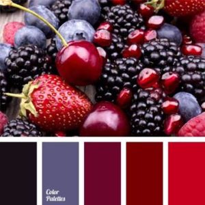
Take a look at the red colors:


These examples show more clearly where the color is cold and where it is warm.
Basically, warm or cold undertones are given by the following shades:
Make the color warm: red, canary yellow or orange.
Cool: white, gray, blue, blue, black or lemon yellow.
When you have an outfit in front of you, for example, green, you shouldn’t immediately remember what color it belongs to. Try to see other shades in it. The first is cold, the second is warm.


Second example of green images:


The first is clearly warmer than the second. We hope you are already able to determine the color temperature.
But don't worry if it's difficult right away. All comes with experience.
Example of purple color:


As you can see, in the first photo the purple is diluted with a red tint, which immediately fills the color with warmth.
So don’t roughly separate colors and think that, for example, if you have a warm color type, blue doesn’t suit you. Just choose shades of blue with warm undertones. For cold color types it’s even simpler; you just need to whiten the warm color with white or darken it with black.
The material can also impart temperature to the color. Matte, suede fabrics add warmth, while shiny fabrics make colors cooler.
As mentioned earlier, colors have three characteristics
- one of the pair.
warm-cold
soft - bright
light - rich
Today we will focus on the distinction warm And cold colors
First let's deal with chromatic flowers
For clarity, look at the color wheel again:
As you remember, all chromatic colors can be composed of three primary colors - red , yellow And blue .
Red And yellow psychologically perceived by us as warm colors because they are associated with fire and the sun.

Blue psychologically perceived by us as a cold color because it is associated with water and ice.

Accordingly, those colors in which red and yellow predominate are considered warm (orange , red , yellow), those in which blue color predominates ( blue , blue, lilac), are considered cold .
Those colors that contain equal amounts of warm and cool colors ( green= yellow+blue, violet= blue+red) are usually considered neutral.
Now let's return to the fact that all secondary and tertiary colors consist of two chromatic colors in different proportions(when adding a third one appears gray shade, but we won’t go deeper there for now). The color that predominates usually determines color, tone (overtone).
However, in color design, another color that is part of the shade is also important. This color is called halftone (undertone)
. Halftones make colors within the same hue “warm” and “cool.”
. For example, warm red and cool red. Cold halftones - blue. Warm undertones - yellow and red. U orange color There are no cold undertones - this is the only absolutely warm color.
Here are examples of warm and cool shades of the same color:
The first column is warm halftones, the second is cold halftones

Usually, when talking about color combinations, colors with the same undertone are combined. In the theory of color types, cold and warm colors refer to colors with cold and warm undertones.
General rules for combining colors depending on the undertone:
Colors with the same undertone go well together. Colors with different undertones do not combine well, however, in clothes they can sometimes be combined in small quantities to create accents.
Compare:
1 picture - cool purple
(halftone blue) + cool green
(halftone blue) - harmonious
2 picture - cool purple
(halftone blue)+ warm green
(halftone yellow) - disharmony

In nature, colors are usually combined with one halftone
Cold halftones : cold blue, light blue, cold bright red, burgundy, cold green, light gray.

Warm undertones : warm yellow, yellow-orange, red clay, warm green, olive, marsh

Now, as for achromatic colors :

Clean black, white And grey are considered cool colors - they harmonize well with them.

Medium gray can sometimes act as neutral color, due to the fact that it is a combination of two opposite colors.
Red is a warm color, but the range of its shades is divided into equal halves of tones, which can be contrasted with each other according to color temperature. Why is this necessary?
As a bright color, red narrows the space, but expands the shape; increases heart rate and breathing rate; warms and activates, and sometimes causes aggression. All these properties belong to a bright warm tone, however, as its temperature decreases, all these qualities are softened and disciplined, smoothly turning into a cold one. Therefore, even among the red range you can find a shade that will be emotional, rich, but restrained and noble.
Dividing shades of red into cold and warm is necessary when selecting colors for certain colors and types of appearance. Everyone knows that red is suitable for “spring” and “winter”, but there are a number of colors that are quite suitable for “summer” and “autumn”. So for “summer” the cold tone of this palette is suitable, and for “autumn” - warm, but not very bright.
However, it can be obtained. The result is a medium red.
If we change these proportions, then we get a shade of red that either turns pink or orange, respectively, and this is where the division into cold (with a pink undertone) and warm (with an orange undertone) begins.
Majority bright colors This range is in the warm segment, as close to the pure spectrum. If you try to create a bright, cool tone, it will turn out more pink than red. However, there are more rich dark reds in the cool toned range. This is because shading with a hint of blue is more effective than shading with just black. In the first case, we get a purple undertone, which, with the slightest change in lightness or the proportion of red-blue, changes its appearance and color. The second case is more boring, since only the lightness changes, and its minor fluctuations are not noticeable to the eye.


So, to summarize: how the warmth of the red color changes.
- the brightest red is in the middle lightness and is warm;
— scarlet is considered the lightest, brightest and warmest red;
- more bright hues red with a deviation to pink will be colder and less bright relative to the original;
- the darker the tone, the colder it is: any admixture of black, brown, gray sharply reduces the temperature and properties of a bright color;
- colder dark shades will be considered colors with an admixture of blue.

Warm red and its shades
Shades of red can be divided into following categories:
- bright, pure tones, close to the spectral color: medium red, bright red, scarlet, Chinese, garnet, Falun, etc.
- moderately saturated or dark red: dark red, coral red, terracotta red, cardinal, tomato...
- pale shades of warm red: alizarin, chicory red.
- burgundy: mahogany, earth, port...

(1) Medium red, (2) dark red, (3) mahogany, (4) bright red, (5) red-orange, (6) scarlet, (7) Chinese red, (8) coral red, (9) terracotta red, (10) garnet, (11) rust, (12) falun red, (13) earth red, (14) alizarin, (15) chicory red, (16) cardinal, (17) tomato, (18) scarlet, (19) port, (20) red-burgundy.
Cool red and its shades
The cool tone of red can be distinguished from the following subgroups:
- light red-pink: light red, red-coral, red rose, watermelon, light red-coral...
- cold, pale tone: cinnabar, cherry, marsala, pink-burgundy...
— richer ruby: ruby, bismarck furioso, bogryan, coral-burgundy, ruby-burgundy...
- dark purple-burgundy: burgundy, wine, dark burgundy...

(1) ruby, (2) cinnabar, (3) light red (4) cherry, (5) red coral, (6) burgundy, (7) wine, (8) carmine, (9) bismarck furioso, ( 10) red rose color, (11) watermelon, (12) burgundy, (13) marsala, (14) light red coral, (15) raspberry coral, (16) pink burgundy, (17) coral burgundy, ( 18) bright burgundy, (19) ruby burgundy, (20) dark burgundy.
Warm red color often plays a solo role in combinations: contrast of color spots. Like a bright flash over cooler and more restrained tones, it fills the palette with living fire. Giving it movement, desire, purpose.
The contrasts of warm and cold and additional colors involving green and combinations with neutral shades. The darker the tone, the less inconspicuous it is and fits smoothly into the overall scheme.


Look at the difference with the opposite colors of this range:
Cold red, even if it takes central part composition, does not evoke violent emotions, unlike its opposite. It blends softly into palettes and usually comes in a range of lighter or darker sister shades that create natural dimension. The contrasts with them are smooth, unobtrusive, natural.


Warm and cool reds go together
To deepen and diversify the red background or element, mix both directions. The resulting version is distinguished by its versatility, and the combination with such a gradient is even more juicy and lively. By themselves, these shades enhance each other, and in the presence of other colors they expand the scope of impressions.

Cold and warm blue colors have different undertones: yellow and gray make shades of blue warmer, and pure ones: light and dark, with the addition of red, make them colder.
Based on the principle of dividing colors into cold and warm, blue is, of course, a short wavelength color and appears in the winter palette. However, according to the principle of relativity, which is fundamental in determining the warmth of a shade, blue shades can be divided into conditionally cold and warm. This division will help you in composing a combination of colors, since they behave differently.
How to get blue color and its shades?
Blue color refers to: it cannot be obtained by mixing other paints, but it itself is very actively used to obtain various shades of not only blue, but also green, purple, as well as complex shades of red, brown and yellow.
They have a wide range. Their construction is based on mixing blue with other primary colors such as white, black, red and yellow. The result is light shades, dark, with a violet tint or sea green color.
Light and dark shades of blue
Light shades of blue are obtained by mixing with white, which tends to be cold in its properties, but is essentially neutral, since white is a fusion of all color waves. Consequently, the shades born from such a mixture will be cold.
Dark shades of blue appear as a result of mixing black and blue, where black is also a cool color. The darker the color, the cooler it is. And dark shades of blue will be cooler than its pure tone.

However, blue diluted with gray will be warmer than its pure, light and dark colors, formed without admixture of other primary colors. Grey colour is neutral and its addition mutes the main qualities of the cool blue color.

Shades of blue vary in tone
In addition to brightening, dimming or darkening, shades of blue are built by adding other tones such as yellow or red.
Both yellow and red are warm colors, and it would be more logical to assume that the colors formed with their help will be warmer than the main one blue tone. However, blue shades formed with the help of red will belong to the cold group, and those formed from yellow will belong to the warm group.
This paradox is explained by the fact that the violet wavelength (430-390) (which is obtained by mixing red and blue) is smaller than the blue wavelength (450-440). Thus, shades of blue with a violet tint are cooler than pure blue tones.
Yellow, when mixed with blue, gives green tint. The green wavelength is longer (530-490) than the blue wavelength (450-440), which leads to more warm shades blue.

CONCLUSION: cool shades of blue are obtained by adding white, black and red to the pure color.
Warm shades of blue are obtained with the addition of yellow and gray.
Cool blue color

Cool blue colors are the following shades: (1), (2) cyan, (3) electric blue, (4) Royal blue, (5), (6) blue-violet, (7) cornflower blue, (8) royal blue , (9) thunderous color, (10) blueberry, (11) , (12) sapphire, (13) , (14) cobalt, (15) indigo, (16) ultramarine.
Warm blue color

Warm blue color is a complex shade, most of which fades moderately into green color. These are colors such as (1) , (2) topaz, (3) , (4) dark blue, (5) , (6) color sea wave, (7) black sea, (8) Prussian blue, (9) hyacinth, (10) steel, (11) denim color, (12) gray color, (13) gray-green-blue color, (14) gray- blue-green color, (15) blue-gray color.
Cool blue color combination
The results are either cold and abstract, or richly contrasting: cold and warm colors.


Warm blue color combination
With warm blue, the combinations are soft and sophisticated. Such shades of blue almost always ask to be supplemented with warm tones, but with cold ones they are lost and only expanded by the range of blue.


Our world has never been monochrome; it contains a huge number of tones and color transitions. Experts say that a person can distinguish about two percent of the shades of what is visible to the eyes of birds and some insects. Instead of an outdated and imperfect system of decomposition white light Based on seven basic color bands, artists, designers and makeup artists have developed their own table of warm and cold colors, because for painting and coloristics the energy of perception, tone and shades have long become more important than the color itself.
Why do you need a color chart?
To be precise, the seven basic, fundamental colors in nature exist only in our perception for our vision. Color science has actually proven that for the human eye there are only three basic color components - yellow, red and blue, plus an additional white. From these three components any color or shade can be obtained, and it can be made warm or cold by adding something more or less hot than the background color.
As a colorist, there is a clear division of colors into three groups:
- Warm tones include yellow, red and orange;
- The cold group includes blue, cyan, violet;
- Green can be equally classified as both warm and cold, but, according to experts, the green color is a relative of white, that is, completely balanced.
For your information! This division into warm and cold is quite arbitrary; it would be easier to use the concept of free energy. But the problem is that the shades of warm and cold content need to be systematized and, most importantly, selected for compatibility, based on human perception, and not on the basis of these devices.
A person does not have additional sensory organs with which one could try a shade “to the teeth”; all that remains is the receptor sensation of heat and cold, which we are trying to use when classifying into cold and hot bases.
Using a table of cool and warm colors
The practical application of gradation into cold and warm colors is based partly on human psychology on the basis of several rules of mutual influence:
- The definition of “cold” or “warm” occurs only on the basis of a person’s own psychological experience and stereotype. For example, white and blue are associated with ice and snow, so their combination can be considered cold;
- Contacting on one color field two zones of pronounced warm and cold color mutual equilibrium influence. For example, when blue and red colors come into contact, the first becomes softer, warmer, the second becomes emotionally piercing and harsher;
- Mixing color bases with each other with the addition of white allows you to control the visual color temperature.
For your information! Using the last two points, the table tries to describe the mechanism of how you can make the perception of a shade warmer or colder, since the associative method does not give a 100% result.
The same combination of white and blue different people can cause completely different associations. For some it is cold blue ice and snow, for others it is a hot blue sky around a white sun. Therefore, we moved from psychology to the temperature of the color matrix.
How to change color temperature
The easiest way to illustrate the effect of changing color temperature is with the three most important colors to us, yellow, green and red.
For a warm yellow color, you can increase the temperature only by adding shades with lower energy, for example, red, as in the table.

Warmer than basic yellows include, for example, honey yellow, dandelion or sunflower.


To transition to cooler tones, add green or blue.

Red is warmer energetically than yellow, so its temperature is more difficult to control. The gradation of energy in different shades of red is the most difficult to perceive.

To make a red color cooler, you have to shift its background towards violet using the addition of blue and gray.

Insulating red is much easier with the addition of yellow.

Green color changes according to temperature saturation much more easily, since it can be obtained by mixing two components with different temperatures - yellow and blue. The procedure for imparting the necessary energy actually comes down to enhancing one of the color components.